Choosing a Calm, Neutral Stationery Aesthetic for Your Brand
Neutral branding stationery is not about playing it safe—it is about creating space for your message and products. Calm, refined, quietly confident—never bland.

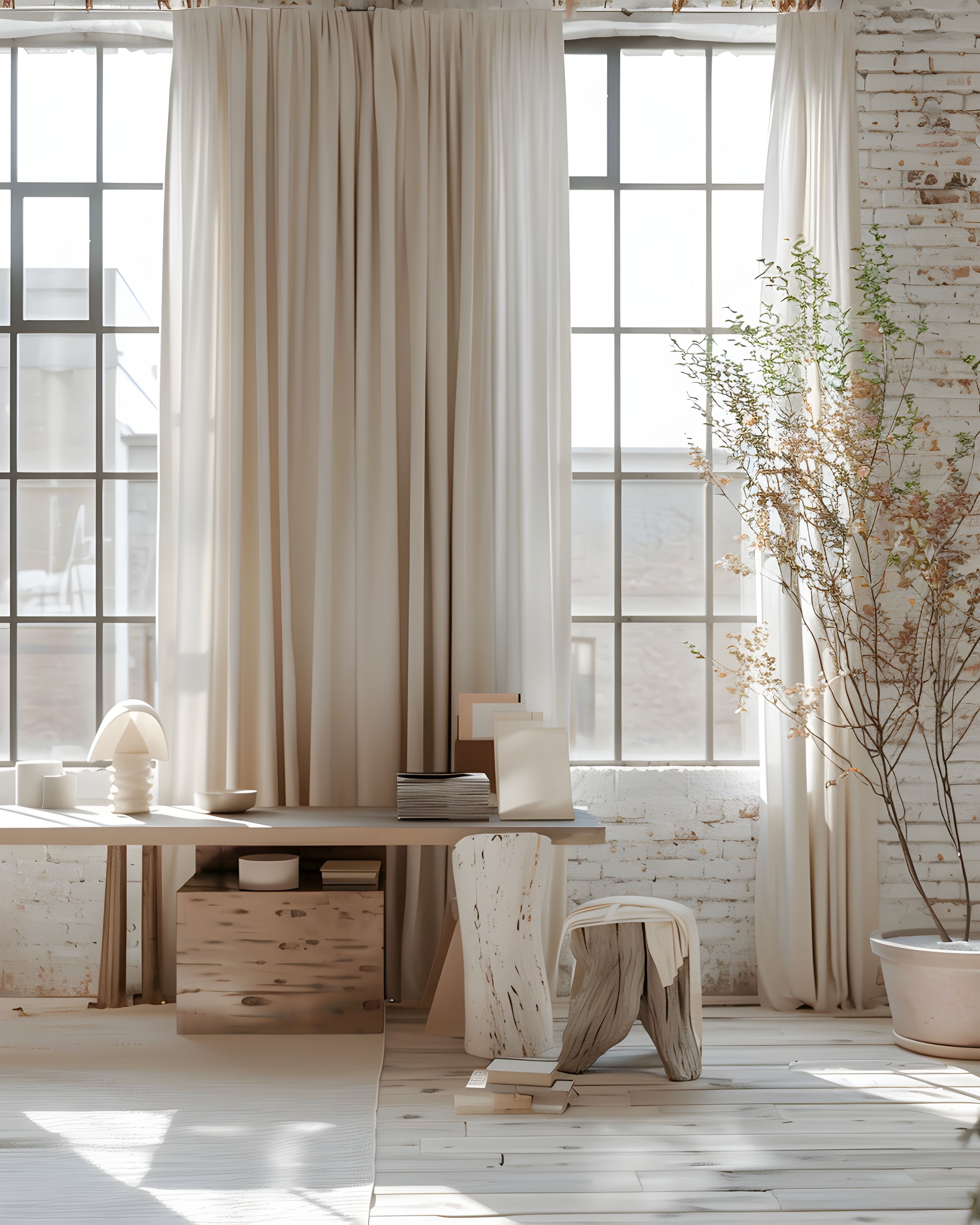
Neutral branding stationery isn’t about playing it safe—it’s about creating space. Space for your message, your photography, and your products to speak clearly. When done well, a calm palette feels grounded, refined, and quietly confident—never bland.
For many women-led businesses especially, this softer approach aligns more naturally with their values: thoughtful, considered, and built to last rather than chase trends.

Why neutrals work harder for small brands
Neutrals are incredibly adaptable. The same thank you card, business card, or insert can move effortlessly between a spring launch, an autumn workshop, or a winter promotion without ever feeling out of place.
They also age well. While trend colours can date quickly, a neutral foundation keeps your brand looking current for years, not months.
Search behaviour reflects this too—people are drawn to terms like “minimal business stationery,” “neutral thank you cards,” and “soft branding.” These aren’t just visual choices; they’re emotional ones. They signal calm, trust, and quality.
And for a growing business, that consistency builds recognition quietly but powerfully.
Build a palette with intention
A strong neutral palette is simple—but never accidental.
Start with:
- A base: warm white, cream, or soft off-white
- A mid tone: stone, warm grey, muted clay, or taupe
- A single accent: something subtle but distinct (deep olive, charcoal, muted terracotta, or soft black)
That accent becomes your quiet signature. You might use it for headings, fine rules, icons, or small design details.
Resist the urge to add more too quickly. When your palette feels effortless across multiple pieces—cards, packaging, inserts—that’s when it’s working.

Typography: clarity over decoration
Typography carries more weight in a neutral design, so it needs to be intentional.
A simple, effective pairing:
- A serif for headings (adds warmth and elegance)
- A clean sans serif for body text (keeps things readable and modern)
—or the reverse, depending on your brand tone.
What matters most is hierarchy:
- One clear headline style
- One easy-to-read body style
- Plenty of breathing room (line spacing and margins)
If someone can scan your card in two seconds and understand it instantly, you’ve done it right.

Texture and finish: where the magic happens
With colour kept minimal, texture becomes your differentiator.
Look for:
- Matte or uncoated papers for a soft, organic feel
- Cotton or textured stock for subtle depth
- Soft-touch finishes for a more refined, tactile experience
High gloss can feel too sharp or commercial unless your brand leans deliberately bold.
A good rule: your stationery should feel the same way your website looks.

Grow the system, not the noise
Once your foundation is set, expansion becomes easy—and calm.
Instead of reinventing the wheel, you simply extend the system:
- Add new pieces (flyers, inserts, labels)
- Keep the same palette and type
- Repeat your accent consistently
This is how a brand starts to feel recognisable rather than just nice.
A well-built neutral stationery system doesn’t need constant redesign—it evolves quietly, staying aligned whilst your business grows. When you are ready for the next matching piece, browse branding stationery by category and extend what already works.