As an interior designer, you understand the power of negative space. A room doesn’t need to be full to feel complete — the quiet corners and the breathing room between pieces are often what make a space feel intentional rather than cluttered.
The same principle applies to your website portfolio. Yet many designers showcase their beautiful, spacious interiors on websites that feel cramped and busy. The disconnect is subtle, but it often costs quiet opportunities.
The Problem with Crowded Portfolios
When potential clients visit your website, they’re often browsing on their phones during a busy day. They might be renovating their home, moving into a new space, or finally ready to invest in professional design help. They’re looking for someone who understands their desire for a calm, intentional home.
If your portfolio is a wall-to-wall grid of images with tiny thumbnails, cluttered navigation, and competing CTAs, you’re sending an unintentional message: this designer doesn’t value simplicity.
The contrast can feel jarring. Your work might be beautifully minimal, but your website tells a different story.
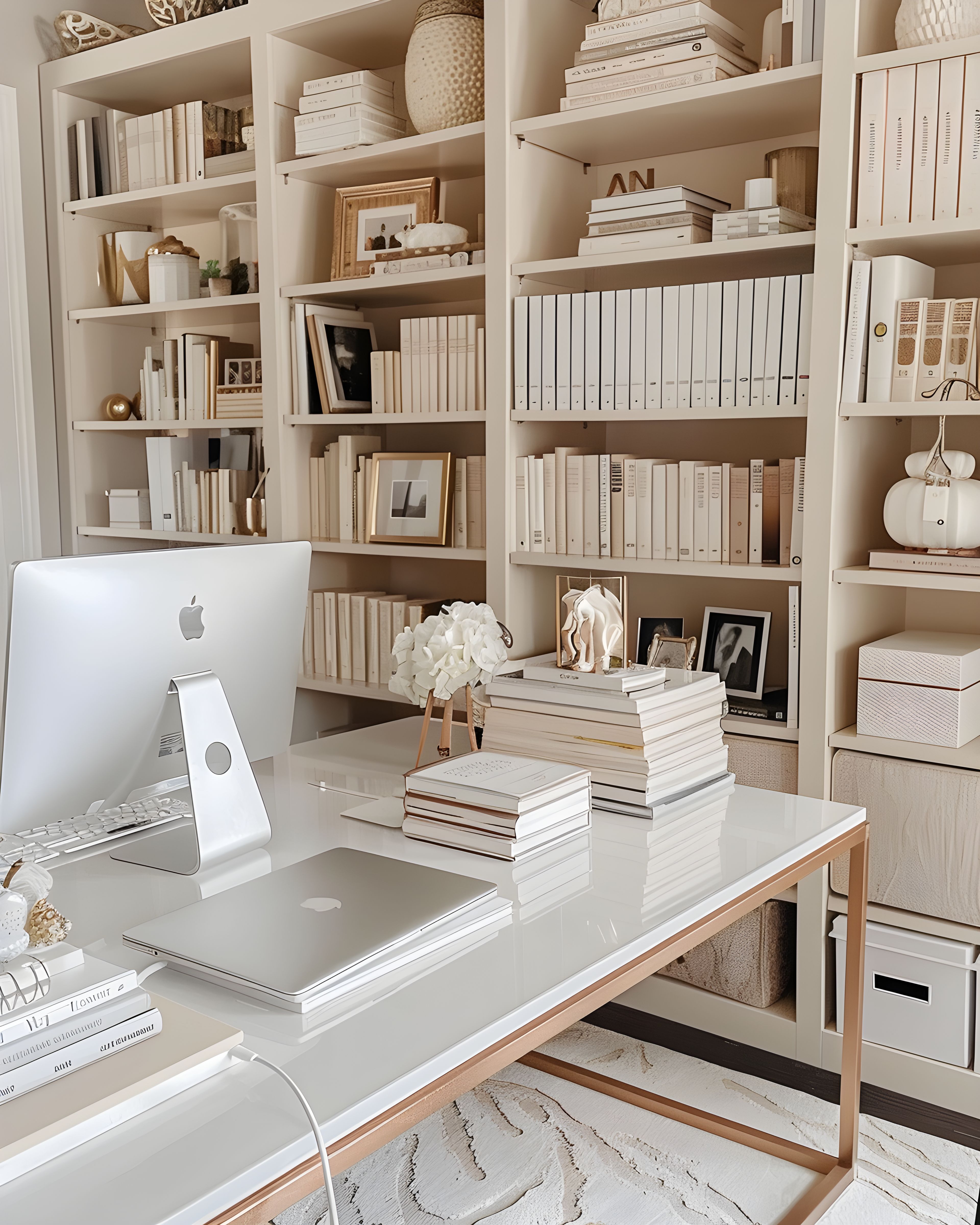
I see this disconnect often. Interior designers create serene, thoughtfully curated spaces — then present them on websites that feel like visual noise. Multiple fonts fighting for attention. Sidebars crammed with widgets. Galleries where images are so small they might as well be postage stamps. Pop-ups appearing before visitors have had a chance to see a single project.
The message this sends is clear, even if unintended: this designer isn’t aligned with their own philosophy. And while that’s rarely true — most designers are simply using whatever template came with their platform — potential clients don’t know the backstory. They only see what’s in front of them.
What White Space Actually Does
White space — or negative space — isn’t wasted space. It’s working space. Here’s what generous margins and breathing room accomplish on a portfolio website:
Directs attention to your work
When there’s nothing competing for attention, visitors naturally focus on what matters: your projects. Each image gets the stage it deserves. Your work speaks for itself without shouting over navigation bars, sidebar widgets, and pop-up forms.
Creates a sense of quality
Luxury brands understand this instinctively. Think of high-end fashion magazines, gallery exhibitions, or boutique hotel websites. They all use generous white space because it signals confidence and quality. Your portfolio should feel like an exhibition, not a catalogue.
Reduces cognitive load
When visitors don’t have to work to understand your site, they stay longer and engage more deeply. A calm, uncluttered portfolio is easier to browse — which means potential clients actually see your best work rather than bouncing after three seconds.
Reflects your design philosophy
Your website is the first interior a potential client experiences with you. If you design calm, intentional spaces for living, your website should feel like a calm, intentional space for browsing. Consistency builds trust.
Improves mobile experience
The majority of your website visitors are browsing on mobile devices. On a small screen, white space becomes even more critical. Cramped layouts that might be tolerable on desktop become genuinely unusable on phones. Generous spacing makes tapping, scrolling, and reading dramatically easier.
Supports faster loading
Simpler layouts with fewer competing elements typically load faster. And page speed matters — not just for user experience, but for search visibility. Search engines tend to favour fast-loading websites. Less clutter often means better performance.
Practical Ways to Create Breathing Room
You don’t need to redesign your entire website to create more space. Here are a few quiet adjustments you can make now:
- Show fewer projects, but better. Curate with care. Five exceptional projects presented beautifully will attract better clients than twenty projects crammed into a grid. Each project you show is a statement about the work you want to attract.
- Increase your margins. Most websites have margins that are too small. Double them, then see how it feels. What looks like “too much” space on your laptop often looks perfect on a visitor’s screen.
- Use larger images. Let each project image fill the screen. Give visitors the immersive experience of actually being in the space. Small thumbnails can make work feel smaller.
- Simplify your navigation. Do you really need seven menu items? Most visitors only want to see your work, learn about you, and get in touch. Everything else is noise.
- Remove the sidebar. If your portfolio pages have sidebars, consider removing them. Let the work take centre stage. Sidebars often pull focus away from the work itself.
- Limit your fonts. One serif and one sans-serif is usually plenty. Too many typefaces create visual friction, even if you can’t name why something feels “off.”
- Reduce your colour palette. A restricted palette — perhaps just your brand colour plus neutrals — creates visual calm and lets your project images breathe.
The Psychology of Space
There’s a reason luxury brands use white space so liberally. In retail, it’s called the “boutique effect” — when products are displayed with generous spacing, customers perceive them as more valuable. The same principle applies to your portfolio.
When your projects are presented with breathing room, visitors unconsciously attribute higher value to your work. It’s not manipulation — it’s simply allowing your work to be seen properly. A painting looks different in a cramped antique shop versus a white-walled gallery. Your portfolio works the same way.
Consider how your ideal clients live. They likely appreciate quality over quantity. They’d rather have one beautiful piece of furniture than five mediocre ones. They understand that what you leave out is as important as what you include. Your website should speak this same language.
Common Mistakes to Avoid
Beyond the obvious clutter, there are subtler ways designers undermine their portfolios:
- Before-and-after sliders on every project. One or two is fine; more becomes distracting. The “after” should be strong enough to stand alone.
- Endless scrolling galleries. If visitors need to scroll through forty images to understand a project, you haven’t curated. Choose the six to eight images that tell the story.
- Autoplay videos with sound. Unexpected audio can feel jarring. If you use video, let visitors choose to play it.
- Pop-ups asking for contact details. Especially on first visit. Let people see your work before you ask for anything in return.
- Heavy animations on scroll. Subtle motion can be beautiful. But when every element bounces, fades, or slides into view, the effect is tiring rather than refined.
The Alignment Principle
There’s a simple test for whether your portfolio website is working: does it feel like the spaces you design?
If you create serene, minimal interiors, your website should feel serene and minimal. If you design warm, layered, collected spaces, your website should have that same warmth and thoughtful curation.
The goal isn’t minimalism for its own sake — it’s alignment. Your online presence should be an extension of your design philosophy, not a contradiction of it.
This is where working with someone who understands both web design and interior design becomes valuable. A specialist can translate your aesthetic into digital form — creating a website that feels like your work, not like a generic template with your images dropped in.
A Note on Mobile
If you’re evaluating your portfolio, check it on your phone first. Not just a quick glance — actually browse it as a potential client would. Try to find a specific project. Read your about page. Attempt to contact you.
Most designers check their website primarily on desktop, during focused work sessions. But that’s not how clients encounter it. They’re on their phones, often distracted, possibly comparing you to other designers in different browser tabs. Your mobile experience needs to feel effortless.
White space is even more valuable on mobile. Touch targets need room. Text needs generous line height. Images need space to be seen. If your mobile site feels cramped, that’s where your efforts should focus first.
What Happens When You Get It Right
When your portfolio has room to breathe, something shifts. Potential clients arrive and immediately understand what you’re about. They feel the quality before they read a single word. They can picture working with you because your website already feels like the home they want to create.
That alignment — between your work, your values, and your online presence — is what converts browsers into enquiries, and enquiries into clients who are genuinely the right fit.
I’ve seen this transformation many times. Designers who previously attracted misaligned enquiries begin hearing from people who “just knew” they were the right fit. The website does the qualifying work. It attracts aligned clients and gently discourages the rest.
That’s the quiet power of breathing room. Not just aesthetics — though that matters — but clear, intentional communication. Your portfolio, presented with space and intention, tells potential clients what working with you will feel like.
Starting Today
You don’t need a complete redesign to improve. Start with one change: identify the most cluttered page on your website and remove one element that isn’t essential. Maybe it’s a sidebar widget. Maybe it’s a menu item. Maybe it’s half the images in a gallery.
Live with that change for a week. Notice if it feels better. Then make another small improvement. Over time, these incremental changes compound. Your portfolio gradually becomes the calm, intentional space your work deserves.
And if you’d rather take a more focused approach — with a website designed from the start to give your work room to breathe — working with a specialist web designer can help. Someone who understands interior design for faith-rooted, modest brands, who values the same restraint you do, and who can create something that feels like an extension of your practice rather than a compromise.