We’re surrounded by noise. Social media notifications, message alerts, pop-ups demanding our attention. Every website seems to be shouting louder than the last, desperate to capture a few seconds of our increasingly fragmented focus.
For women-led businesses — professionals who understand the value of thoughtful spaces and intentional choices — this digital chaos presents both a challenge and an opportunity.
The Problem with “More”
There’s a prevailing assumption in web design that more features, more content, and more options are always better. The logic seems reasonable: give visitors everything they might want, and surely they’ll find something that appeals.
But research consistently shows the opposite. When faced with too many choices, people become paralysed. When bombarded with too much information, they disengage. When a website feels overwhelming, they leave — often within seconds.
This phenomenon, known as decision fatigue, affects every visitor to your website. And it’s particularly damaging for women-led businesses, whose ideal clients are actively seeking calm and clarity in their lives.
Consider the well-known jam study by psychologist Sheena Iyengar. When shoppers were offered twenty-four varieties of jam, only three per cent made a purchase. When offered just six varieties, thirty per cent bought. More options led to less action.
Your website visitors face the same psychology. When your homepage offers fifteen different paths — services, about, portfolio, blog, shop, testimonials, FAQ, contact, newsletter signup, social links, and more — many visitors choose the easiest option: leaving.
Your Website Is the First Space You Design for Them
Think about the clients you most want to work with. They’re likely people who:
- Value quality over quantity
- Appreciate thoughtful, intentional choices
- Want their home to feel calm and uncluttered
- Are willing to invest in getting things right
- Understand that less, done well, is more
Now consider: what does your website say to these people?
If it’s cluttered with competing elements, aggressive pop-ups, and visual noise, you’re sending a message that contradicts everything you stand for. Your ideal clients might arrive, feel the disconnect, and quietly click away — never to return.
But if your website feels like a calm, intentional space — the digital equivalent of the homes you design — something different happens. Your ideal clients arrive and immediately feel at ease. They think: this designer understands what I’m looking for.
This is the philosophy I bring to every website I design at Sunday Ambience. The goal isn’t minimalism as an aesthetic trend — it’s creating an experience that aligns with what women-led businesses actually offer their clients.
What Calm Actually Looks Like
Minimalist web design isn’t about being boring or sparse. It’s about being intentional. Every element earns its place. Nothing is included by default.
Here’s what calm looks like in practice:
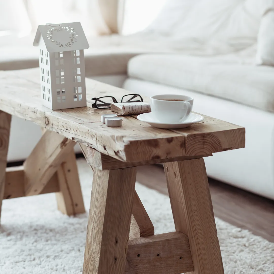
Generous white space
The space between elements isn’t empty — it’s working. It guides the eye, creates rhythm, and gives content room to breathe. Just like in interior design, negative space is as important as what fills it.
Considered typography
Two or three typefaces, used consistently. Hierarchy that makes sense. Text that’s large enough to read comfortably. No decorative fonts fighting for attention.
Purposeful imagery
A few stunning images that tell your story, rather than a gallery of everything you’ve ever photographed. Quality over quantity, always.
Clear navigation
Visitors should never wonder where to click. The path from arrival to enquiry should feel natural, not like solving a puzzle.
Restrained colour
A limited palette used with intention. Accent colours that draw attention where it matters. No competing CTAs in clashing hues.
Single, focused actions
Every page should have one primary purpose. Your homepage might guide visitors to your portfolio. Your portfolio might lead to your contact page. Your contact page converts browsers to enquiries. This clarity of purpose, page by page, creates a natural flow.
What Calm Is Not
It’s important to distinguish intentional minimalism from laziness or incomplete work:
- Calm is not empty. Minimalist design is carefully thought through, not abandoned. Every element is deliberate. Empty feels unfinished; calm feels complete.
- Calm is not boring. There’s a difference between serene and dull. Thoughtful use of texture, subtle animation, and beautiful imagery creates interest without chaos.
- Calm is not inflexible. Minimalist sites can still have personality, warmth, and character. They simply express these qualities with restraint rather than excess.
- Calm is not hiding information. Visitors should easily find what they need. Minimalism in design doesn’t mean minimalism in useful content — it means eliminating the unnecessary while keeping what serves.
The Business Case for Simplicity
Beyond aesthetics, calm websites perform better:
- Lower bounce rates. Visitors stay longer when they’re not overwhelmed.
- Higher conversion rates. Clear pathways lead to more enquiries.
- Better qualified leads. The right clients self-select; the wrong ones move on.
- Improved SEO. Clean code and focused content rank better.
- Easier maintenance. Simple sites are simpler to update and keep current.
There’s also the matter of confidence. A calm, assured website signals that you know who you are and who you serve. You’re not trying to be everything to everyone — you’re the right choice for the right clients. That confidence is attractive.
The Objections (and Why They Don’t Hold)
“But I need to show everything I can do”
You don’t. Your website’s job isn’t to be a comprehensive catalogue — it’s to create enough intrigue and trust for the right people to get in touch. The conversation continues from there.
”Won’t a simple site look cheap?”
Only if it’s poorly designed. Simple and cheap are not the same thing. The most expensive boutiques, hotels, and galleries have remarkably simple visual identities. Restraint signals confidence and taste.
”My competitors have more features”
That’s fine. Let them overwhelm their visitors while you stand out by being refreshingly calm. Not every client wants the busiest option — and those who do probably aren’t your ideal fit anyway.
Real-World Impact
The effects of a calm website extend beyond aesthetics:
- Shorter decision cycles. When your message is clear, potential clients don’t need multiple visits to understand what you offer. They know quickly if you’re the right fit.
- Higher quality enquiries. When you’re not trying to appeal to everyone, you attract people who genuinely resonate with your approach. These enquiries are more likely to convert and more likely to be enjoyable projects.
- Less scope creep. Clients who find you through a clear, intentional website tend to respect boundaries better. They already understand your approach to thoughtful, purposeful work.
- Word-of-mouth that matters. When someone shares your website, they’re sharing the experience of visiting it. A calm, memorable site gets shared with comments like “you need to see this” rather than being forgotten in a sea of similar portfolios.
Start Where You Are
You don’t need a complete redesign to move toward calm. Start with these questions:
- What can I remove from my homepage that isn’t serving a clear purpose?
- Can I increase the space between elements?
- Is my navigation as simple as it could be?
- Am I showing my best work prominently, or is it lost among lesser projects?
- Does my website feel like the spaces I create for clients?
- What would a visitor remember after leaving my site?
- If I had to remove half my homepage content, what would stay?
Each small improvement moves you toward a website that works harder by doing less. And each improvement brings you closer to attracting the calm, thoughtful clients you most want to work with.
The Competitive Advantage of Restraint
Here’s something most designers don’t consider: in an industry where everyone is adding more — more services, more portfolio categories, more social proof — restraint becomes differentiation.
When every competitor’s website feels like information overload, yours becomes memorable simply by being peaceful. Potential clients arrive and think, “finally, something that doesn’t overwhelm me.” That relief is powerful. It creates an emotional connection before they’ve read a single word of copy.
And for women-led businesses specifically, this differentiation is particularly meaningful. Your clients are hiring you to create calm in their physical spaces. When your digital space already provides that calm, you’ve demonstrated your capability before the first conversation.
The Invitation
Your website can be a quiet assertion of your values. It can show, rather than tell, that you understand restraint, quality, and intention. It can be the first peaceful space a stressed potential client experiences with you.
That’s the case for calm. Not minimalism as aesthetic trend, but simplicity as strategy. Not emptiness, but intention. Not less for its own sake, but less so that what remains can truly shine.
If you’d like a website that embodies these principles — one designed specifically for women-led businesses who believe in the power of calm, intentional spaces — I’d love to help you create it. It’s exactly what I do at Sunday Ambience: calm, considered websites for designers who want their online presence to feel as thoughtful as the spaces they create.