Use Your Website as a Hub for Zazzle Collections and Featured Products
Turn your website into a calm shop window for Zazzle collections — curated paths that help buyers find the right designs faster than a marketplace grid alone.

A Zazzle store with hundreds of products can feel impressive and overwhelming at the same time. Visitors who land on your store home see a grid — not necessarily the story behind how your collections fit together.
Your website can act as a calm hub: fewer choices, clearer paths, stronger first impressions. That hub is much easier to maintain when web design is planned around your collections from the beginning.
Curate, do not catalogue
You know which collections earn attention and which designs represent your brand best. Your website should show that judgment — three to six highlighted collections with a sentence each about who they serve.
Link straight to the matching Zazzle collection URL. You are editing the experience, not duplicating inventory.
Browse the full range on Zazzle collections when you are ready to see everything — your site simply opens the right door first.
Seasonal hubs without redesigning Zazzle
Wedding season, planning season, small-business branding pushes — your homepage hero can rotate while Zazzle stays stable. Update one featured block and one journal post rather than rebuilding your store.
That flexibility is difficult inside a fixed marketplace layout — but straightforward on a site you control. A seasonal hero swap on your homepage takes minutes once the structure exists.
Pair physical and digital under one brand
If you sell printed stationery on Zazzle and also offer templates or matching pieces, your hub page can explain how they work together. Buyers planning a cohesive wedding or salon rebrand often need that map.
Our cohesive stationery system article speaks to the same idea for print — the hub concept works for digital shoppers too.
Use imagery you control
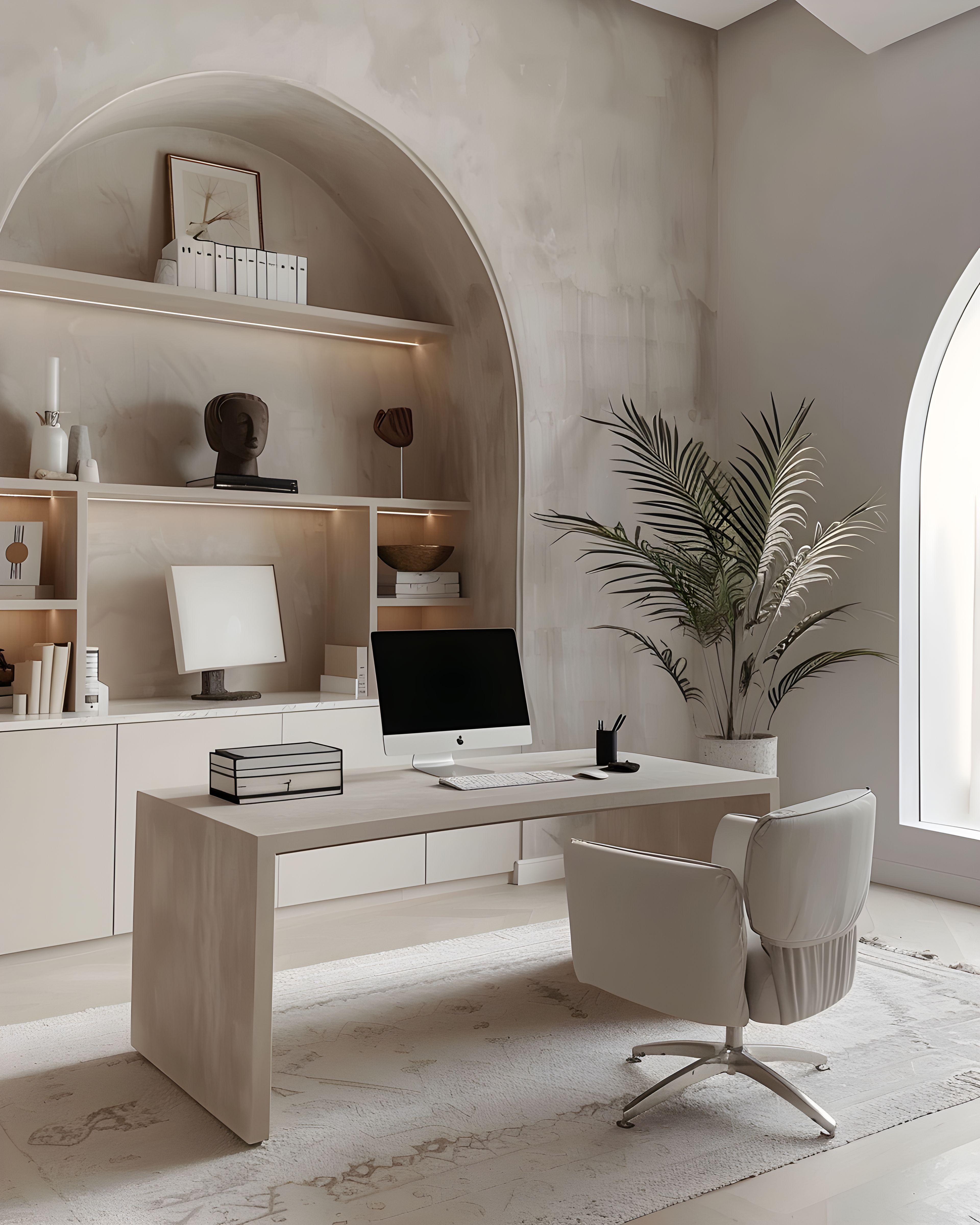
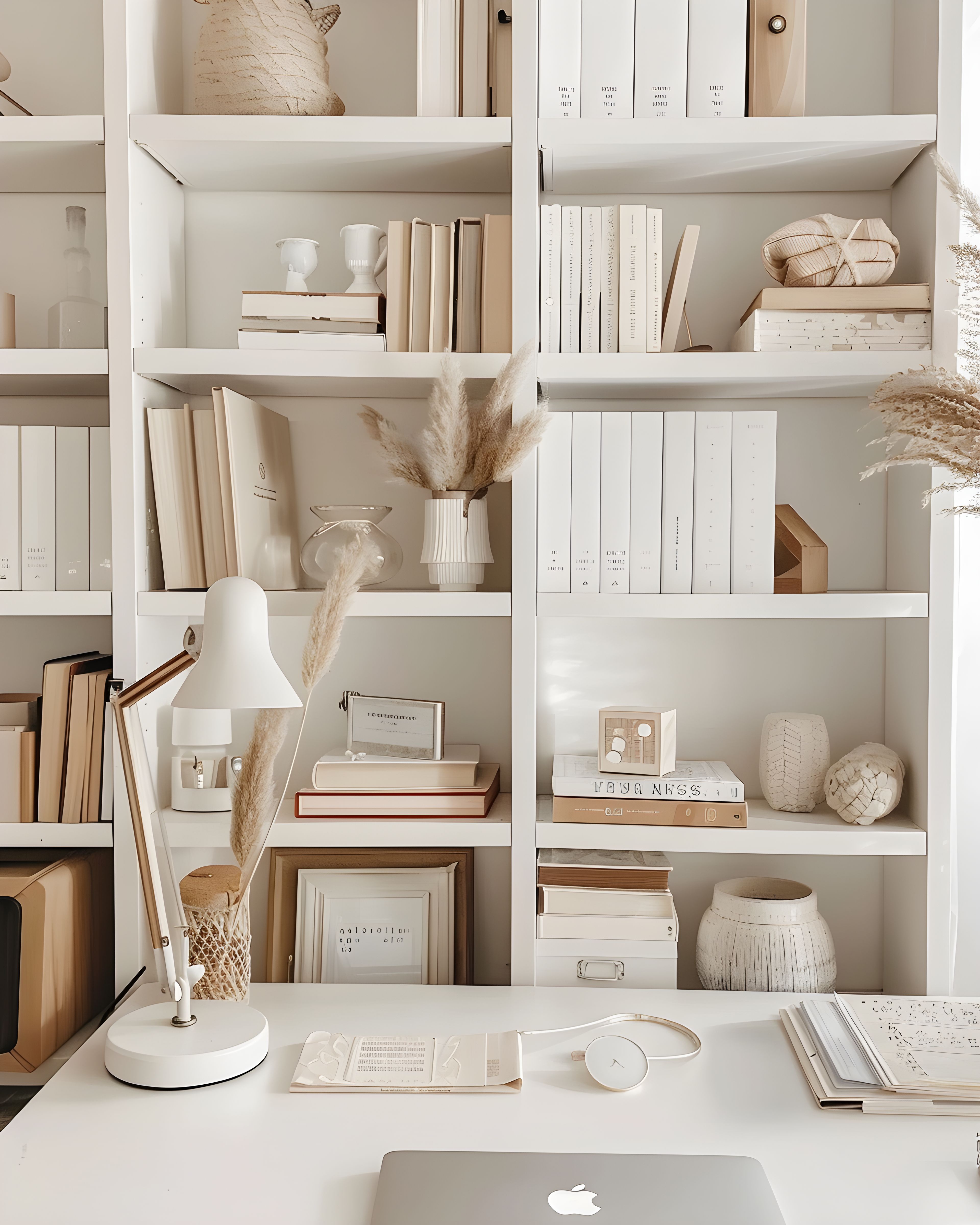
Marketplace thumbnails are functional. Your website can show lifestyle photography, desk scenes, and flatlays that match your aesthetic — the same calm neutral mood as your designs.
Consistent imagery supports premium perception before someone sees price points on Zazzle.
One primary action per page
Each hub section should end with one button. “Shop wedding stationery on Zazzle.” “Browse neutral planners.” Multiple equal buttons create hesitation.
Clarity converts better than choice overload — especially on mobile.
Build the hub into your site structure
When you plan navigation, think “collections first, everything else second.” About, journal, contact, and shop — simple and repeatable.
If you are commissioning a site, mention your Zazzle collection structure upfront so navigation mirrors how you already organise work. Web design services can align the site to your store rather than forcing your store to fit a generic template.
A hub is not extra work forever — it is curation you already do in your head, made visible for customers. If you want help shaping that hub on a new site, see our web design offering for a five-page structure built around Zazzle links.
For a worked example of grouping by style and niche, browse the curated cards on our collections page — the same hub-and-spoke idea, applied to calm stationery sets.