← Back to Portfolio
Mitchell Interiors
Cohesive print pieces — cards, lookbook handouts, and thank-you inserts — in the same quiet palette as the studio’s work.
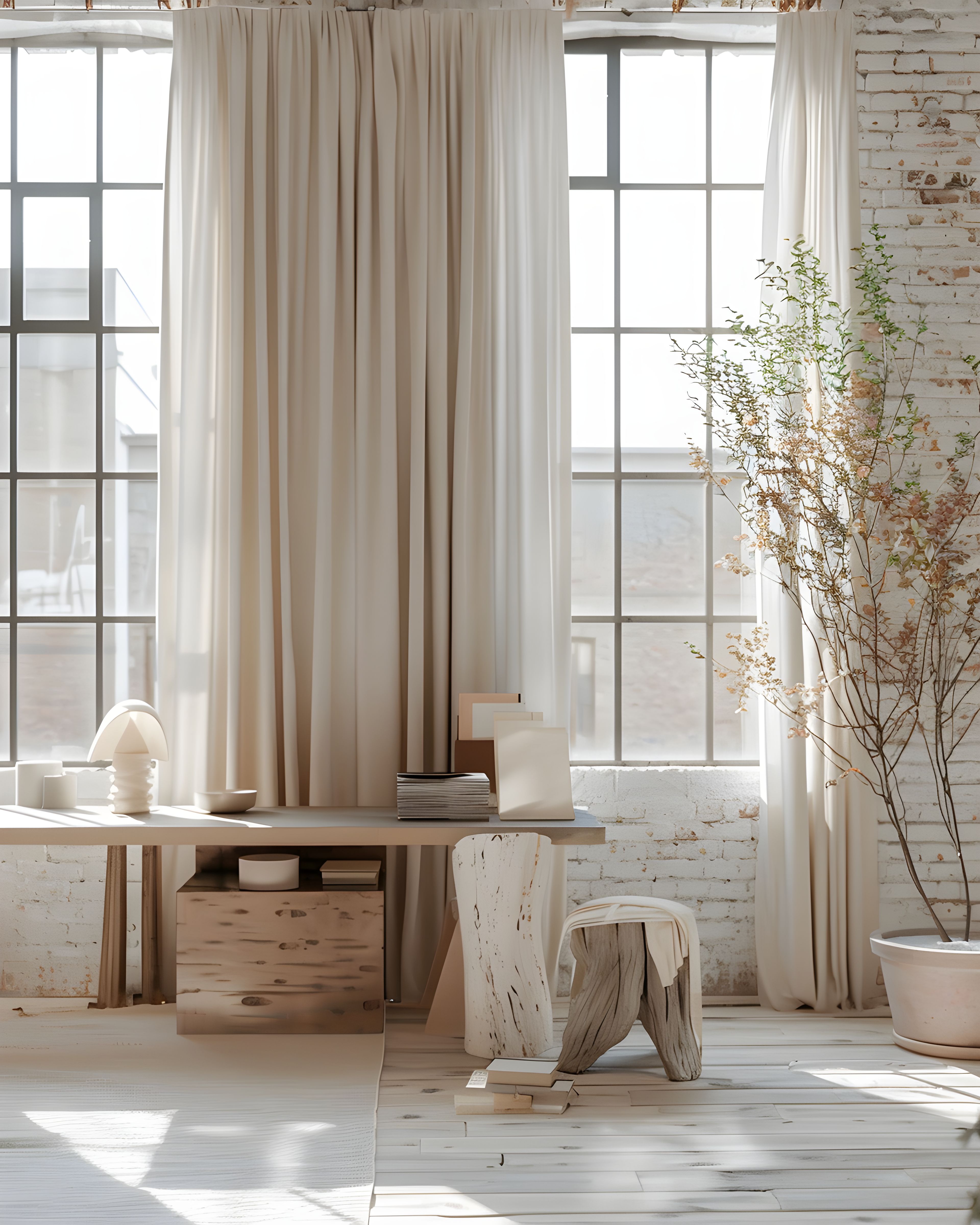
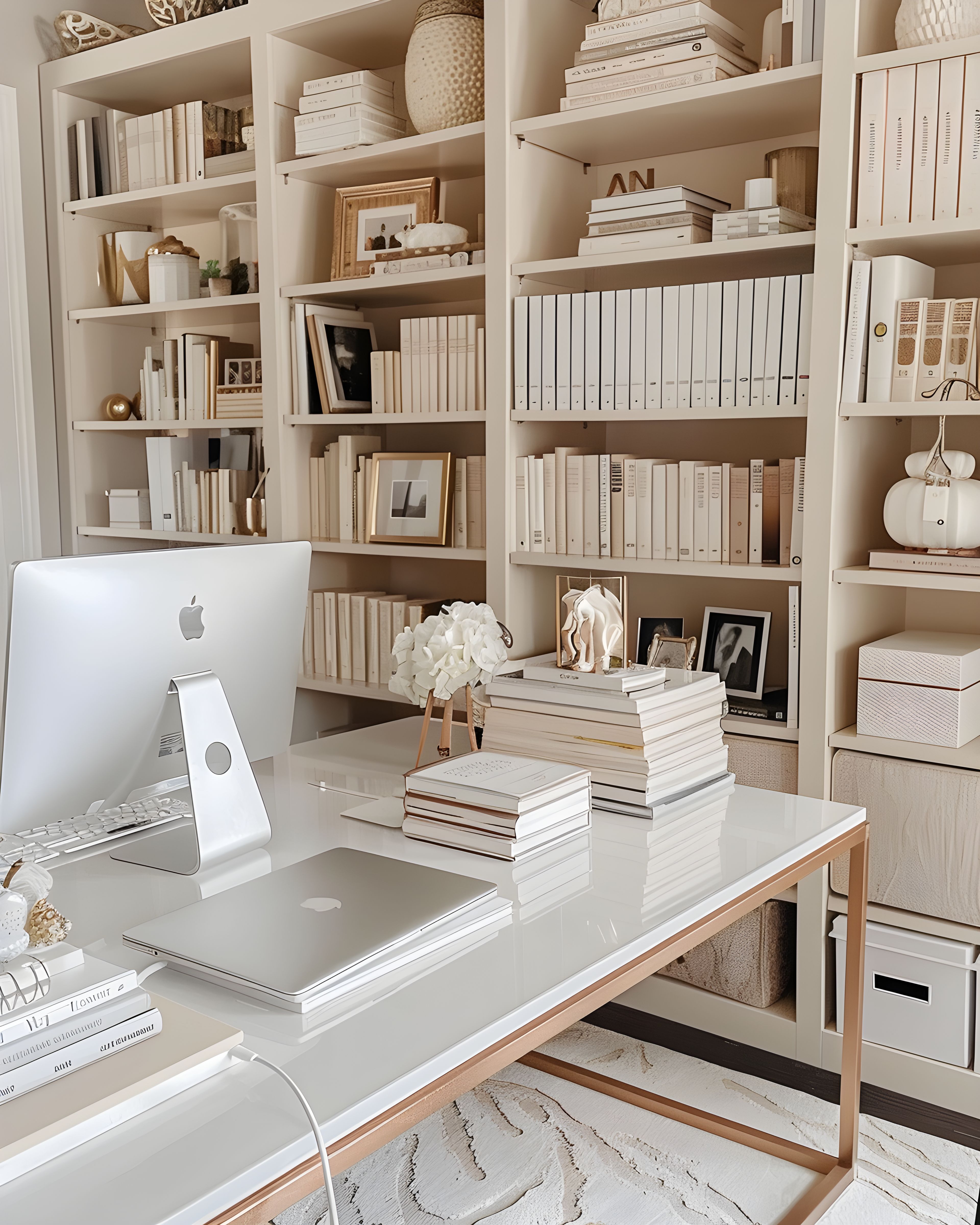
The Brief
The studio needed paper touchpoints that felt as considered as their rooms — not busy, not trendy. Cards and inserts had to sit quietly next to fabric samples and floor plans.
The Approach
One serif headline style, warm white stock tones, and generous margins across cards, A5 leave-behinds, and parcel inserts so every piece reads “calm interior studio.”
Key Features
- Matte business cards
- Lookbook one-pagers
- Neutral palette match
- Thank-you packaging inserts

The Result
Clients noted the studio felt “pulled together” from first card to final install packet.
"Our paper finally matches the rooms we design."
— Sarah Mitchell, Mitchell Interiors
Want this calm look?
Shop templates or explore print-on-demand cards and inserts in the same minimalist branding style.
View products