Beige and Linen-Textured Stationery for Warm, Natural Brands
Textured neutrals for makers and studios. How to keep your print feeling warm and real.
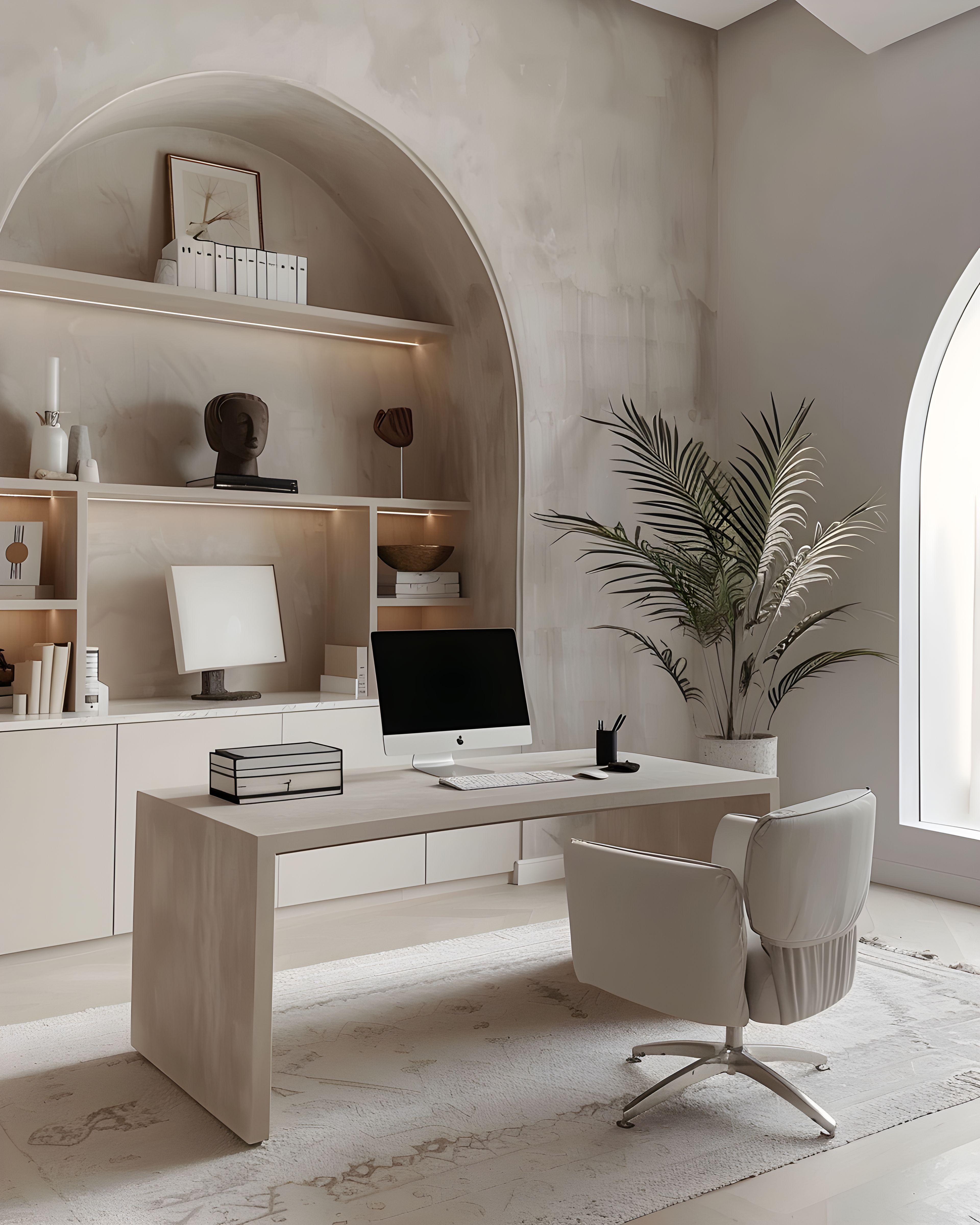
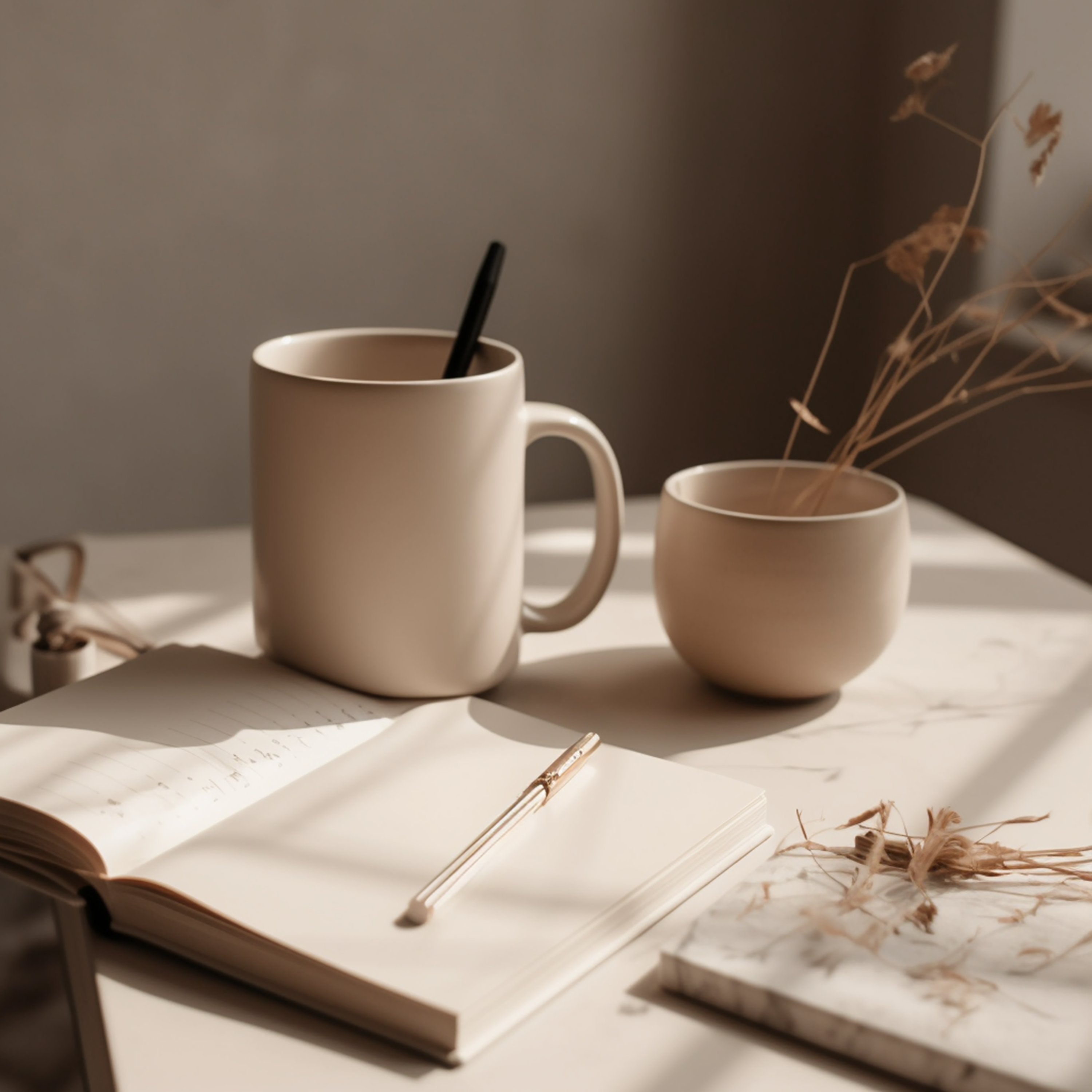
There’s a reason so many makers and studio owners keep coming back to warm neutrals. If your customers reach for your product because of how it feels as much as how it looks, your stationery should match that. A beige, linen-toned palette isn’t about playing it safe — it’s about choosing warmth on purpose and letting it run through everything you send out.
Using texture to set your brand apart
We notice texture before we read words. A warm, linen-toned look says something about the person behind the brand — that they care about quality, that they’re not in a rush. That’s a good fit for skincare, homeware, food, or anything where the product is made with care rather than hype.
Choosing a textured look also gives you staying power. Bold colours and heavy illustration tend to date faster than warm neutrals ever do. A linen-toned palette can carry you through several seasons without feeling tired, and that saves both money and creative energy in the long run. You spend less time wondering whether your brand still looks right, and more time on the actual work.
Photography that matches your stationery
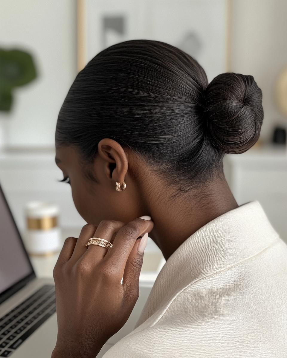
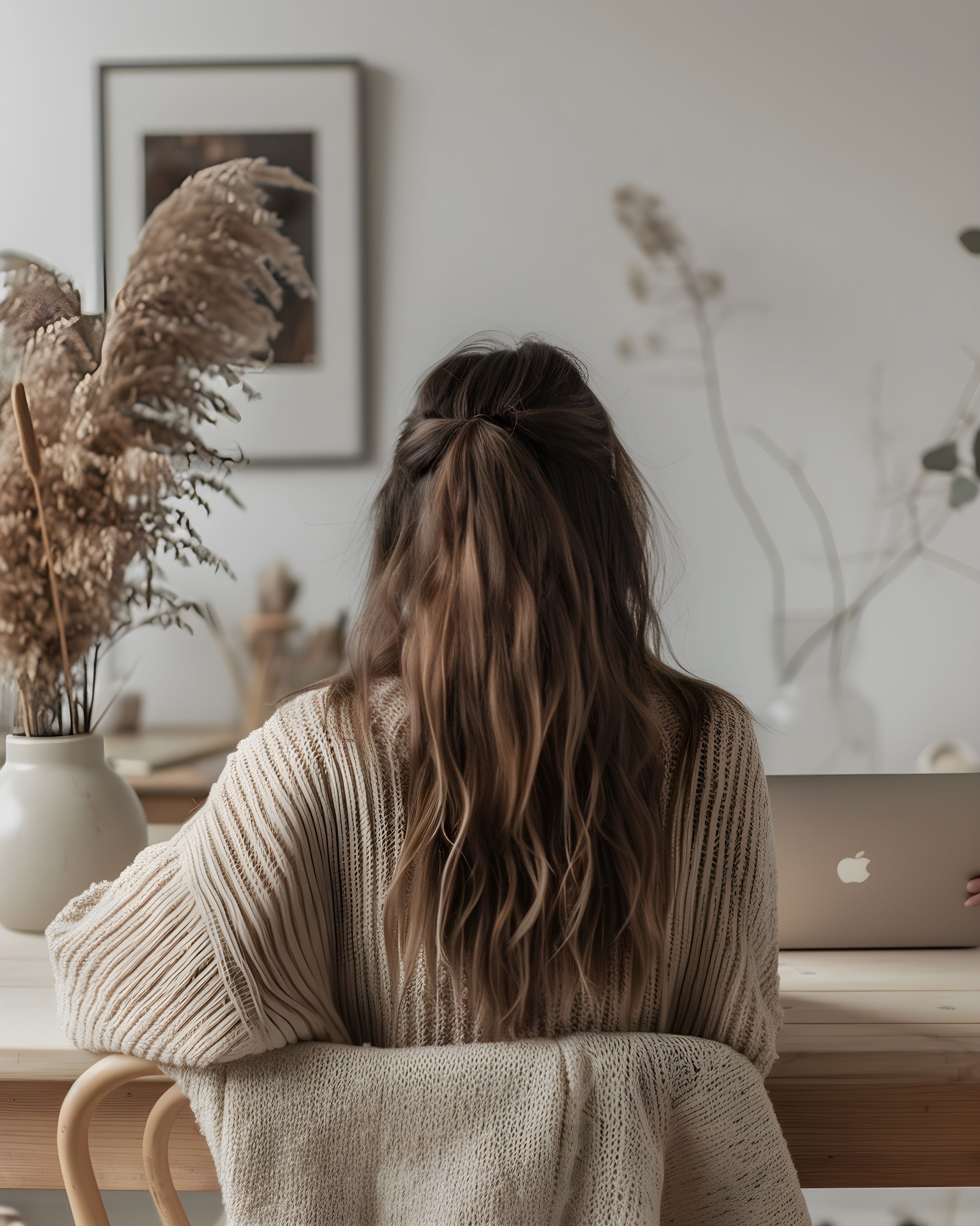
If your stationery has that warm, textured feel, your product photography benefits from the same approach: soft side light, natural shadows, and surfaces that look real rather than glossy. When your photos sit in the same tones as your print, everything starts to look like it belongs together. It just works.
This matters on social media too, where a consistent feed builds trust faster than any single striking image. When the tones in your photography match the tones in your stationery, followers start to recognise your work before they’ve even read your name. That kind of familiarity is hard to buy, and it costs nothing beyond a little discipline and a good eye for natural light.
Packaging that leaves a good impression
Inserts and labels are where texture-led brands really shine. A thank you note that matches the card and the outer wrapping shows that someone put thought into the parcel before it was sent. It’s a small thing, but in a world of plain brown envelopes and generic packing slips, it makes a real difference.
The unboxing moment is brief, but the impression sticks. When a customer peels back tissue paper and finds a note that clearly matches everything else, it feels more personal than a plain receipt ever could. That’s the kind of thing people mention to friends or share in a photo — and that word-of-mouth is very hard to create after the fact.
It’s also worth remembering that packaging inserts are often the most affordable pieces in any stationery suite. A small-run thank you card or a care instruction slip costs very little to produce, yet it carries a big share of your brand’s personality. Getting these details right early gives every parcel a sense of care that customers notice, even if they can’t quite put their finger on why.
Pulling it together
You don’t need many colours when the materials themselves do a lot of the work. A linen-toned suite brings warmth through texture and tone, so your words can stay simple and clear. For related reading at a similar pace, brand consistency in print and calm stationery as a quiet ecosystem may help. If you would like to see curated sets in one place on the site, you can explore matching designs here.
Browse the beige and linen collection on Zazzle. The pieces are all designed to work alongside each other, so you can build your suite bit by bit as your business grows.
If you’d like to see the full range first, our main stationery collections hub has everything in one place.