Lavender and Muted Florals Stationery for a Romantic Look
Soft purples with delicate detail — stationery that feels romantic without being too much. Tips for keeping floral print consistent.
Lavender is one of those colours that sets the tone before anyone’s even read a word. There’s something naturally calming about muted purple — it suggests warmth, softness, and a quiet sort of confidence that works well for beauty, wellness, and creative businesses. If your clients come to you for care as well as skill, lavender-led print suits that nicely.
Choosing it as the backbone of your stationery means your colour palette is already doing some of the work for you. It sets a tone — relaxed, feminine, professional — without you having to spell it out.
Getting the purple right
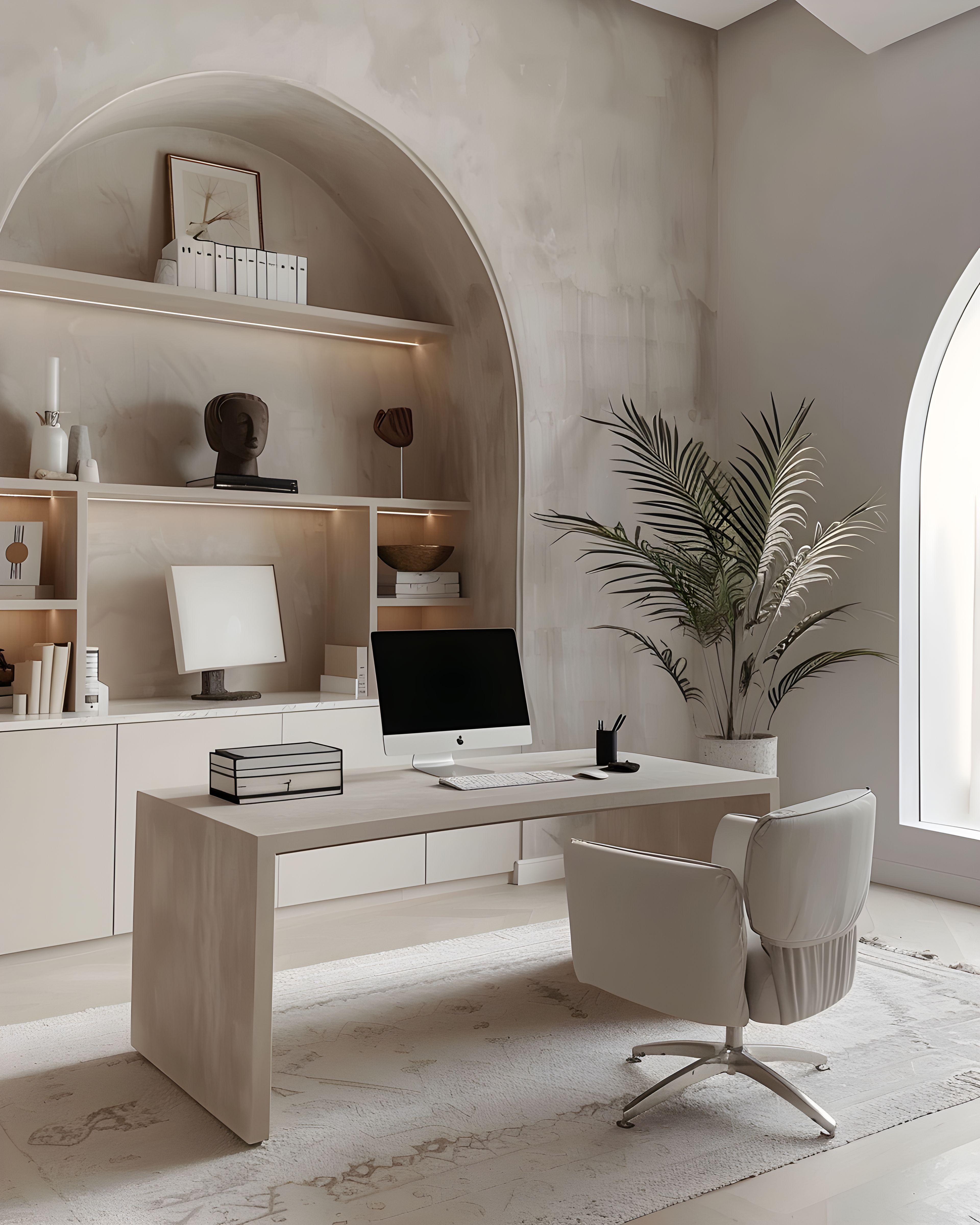
Muted lavender works best when it behaves like a neutral — present, but not competing with your logo or your portrait photography. It’s worth testing print samples if you can; lilac shifts surprisingly under warm and cool light.
This is something to spend a little time on before you commit to a full order. What looks perfectly soft on screen can arrive looking either washed-out or unexpectedly vivid on paper, depending on the stock and the printer. If possible, request a sample print or order a single piece first to check the tone under your studio’s own lighting. You want a colour that feels naturally at home in your workspace — not one that draws attention to itself.
When lavender is kept in check, it becomes a backdrop rather than a feature. That distinction matters: your stationery should frame your work, not compete with it.

Keeping florals consistent across formats
Choose one floral motif style: line-drawn, painterly, or photographic. Mixing styles across cards and packaging is where floral brands start to look disjointed.
Consistency doesn’t mean repetition, though. You can use the same botanical motif at different scales — a full spray on the back of a business card, a single stem on a thank you note, a scattered petal pattern on packaging tissue. What holds the system together is the drawing style, the weight of the line, and the palette. When those three things stay steady, your stationery can vary in detail without ever looking mismatched.
Think of your floral motifs as a family — each piece can use the pattern differently, but the connection between them should always be obvious.
Appointment cards deserve clarity
Pretty backs, tidy fronts. Essential details — times, maps, policies — shouldn’t hide behind decoration.
A lavender floral pattern makes a lovely backdrop for the reverse of an appointment card, but the front should stay clean and functional. Your client needs to find the date, the time, and any preparation notes at a glance. Decorative elements work best at the edges or on the back, where they add personality without getting in the way of the information that actually matters.
This is especially important for appointment-based businesses where clients glance at the card quickly between other things. If someone has to squint to tell the date from the phone number, that’s a problem.

Adding to your collection over time
One of the nice things about a well-matched stationery line is that it never feels rushed. You can start with the essentials — a business card, an appointment reminder — and introduce new pieces as your business develops. A thank you note might come next, then a branded insert for parcels or gift sets.
Because the palette and floral style stay consistent, each addition strengthens the whole set rather than fragmenting it. There’s no rush. The collection is designed to expand at whatever pace suits you. For related reading at a similar pace, brochures that stay readable and printed pieces and brand story may help. Whenever you are ready to browse more broadly on the site, you can view the full collection here.
Have a look
Romantic stationery still has jobs to do — it just does them prettily. You can browse the lavender florals collection on Zazzle to see the full range. Everything’s made to sit together, so you can build your set over time.
If you’d like a wider view first, our main stationery collections hub lists everything in one place.