Luxury Minimal Stationery — Premium Without Being Flashy
Good spacing, subtle detail, and finishes that feel premium in the hand — without being over the top.

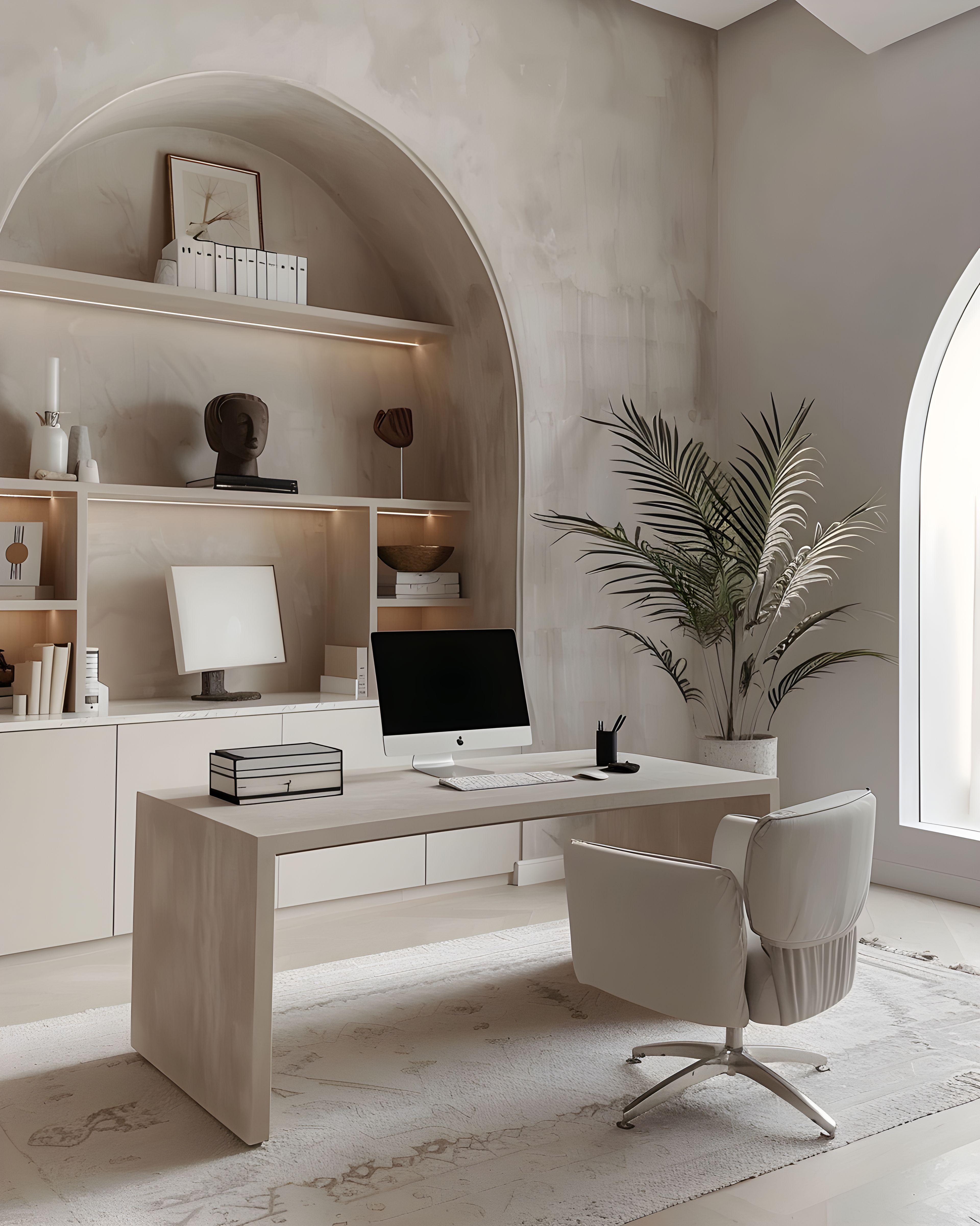
If your brand promises care, your print should feel right in the hand. Luxury, at its quietest, isn’t about extravagance — it’s about precision. The weight of the paper, the generosity of the margins, the way a colour sits cleanly against a white ground: these are the little things that make a client feel looked after, long before she reads a word.
Luxury means knowing what to leave out
True luxury in stationery is often about what you leave out: fewer colours, fewer type styles, fewer gimmicks. What stays must be precise — margins, print quality, paper choice.
This kind of restraint takes confidence. It means trusting that a single well-chosen typeface, set at a generous size with plenty of space, will say more than a card crowded with flourishes. White space does a lot of the work — it frames your name, your details, and your message so everything has room.
The nice thing is, it won’t look dated in a year. Whilst trend-led designs can feel tired within a season, a minimal luxury piece tends to get more comfortable with time. It just stays looking right.
Moments that justify a little extra
Thank you cards, welcome inserts, and proposal covers are sensible places to invest. They’re the pieces people linger on — the ones they photograph or keep.
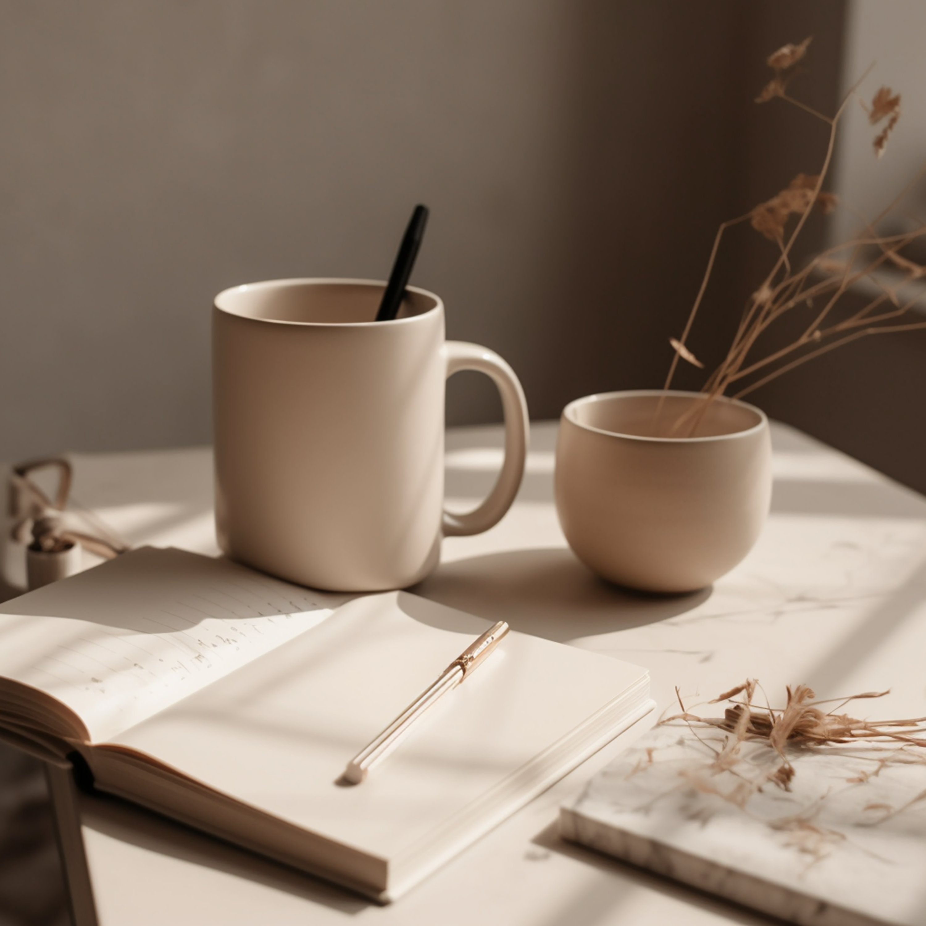
Not every printed piece needs to feel premium. Day-to-day materials — price lists, internal notes, quick-reference cards — can afford to be straightforward. But the moments that matter deserve a bit more attention. A thank you card tucked into a parcel, a welcome note slipped into a client folder, a proposal cover printed on heavier stock — these are the moments where quality really shows.
Investing here is practical as well as atmospheric. These are the pieces most likely to be photographed, shared on social media, or kept on a desk. They work harder for your brand, often for months after they were first received. Choosing a slightly heavier paper, a well-thought-out layout, or a subtle finishing detail for these items is a modest investment with a long return.
Consistency matters more than “wow”
A single flashy piece in an otherwise modest system can look accidental. Build upwards calmly: one tier of special finishes, applied consistently.
Luxury branding is most convincing when it feels effortless, and that comes from consistency. If your business card is beautiful but your packaging insert looks like it was thrown together, the impression falls apart. Better to keep every piece at a steady, solid level — clean layout, matching palette, consistent typography — than to pour your budget into one standout item whilst neglecting the rest.
Each piece should feel like it belongs with the rest — same care, same feel. When the whole set is calm and pulled together, even the simplest piece looks better for it.

Starting small, staying refined
You don’t need a full suite of stationery to begin. A business card and a thank you note, designed within the same minimal framework, are enough to set the tone. As your business grows, you can add appointment cards, packaging inserts, or branded notecards — each one slotting naturally into the existing system because the foundations are already there.
This measured approach suits luxury branding particularly well. It avoids the rush of ordering everything at once and lets you refine as you learn what your business actually needs. For related reading at a similar pace, loyalty cards that still feel calm and brand consistency in print may help. For a gentle sweep of styles and groupings in one place, the collections hub is there when you want it.
Browse the collection
You can feel premium without sounding promotional. Browse the luxury minimal collection on Zazzle — everything’s built to sit together, so you can start with a couple of pieces and add more as you go.
If you’d like a wider view first, our main stationery collections hub lists everything in one place.