Modern Minimalist Stationery With Clean, Simple Layouts
Why generous spacing and neutral tones help small brands look put-together. Practical advice on minimalist print.

If you lean towards clean layouts and a soft neutral palette, you’re not chasing emptiness — you’re choosing clarity. Minimalist design, done well, isn’t about having less for the sake of it. It’s about making sure everything that’s left has earned its place.
Why whitespace isn’t “nothing”
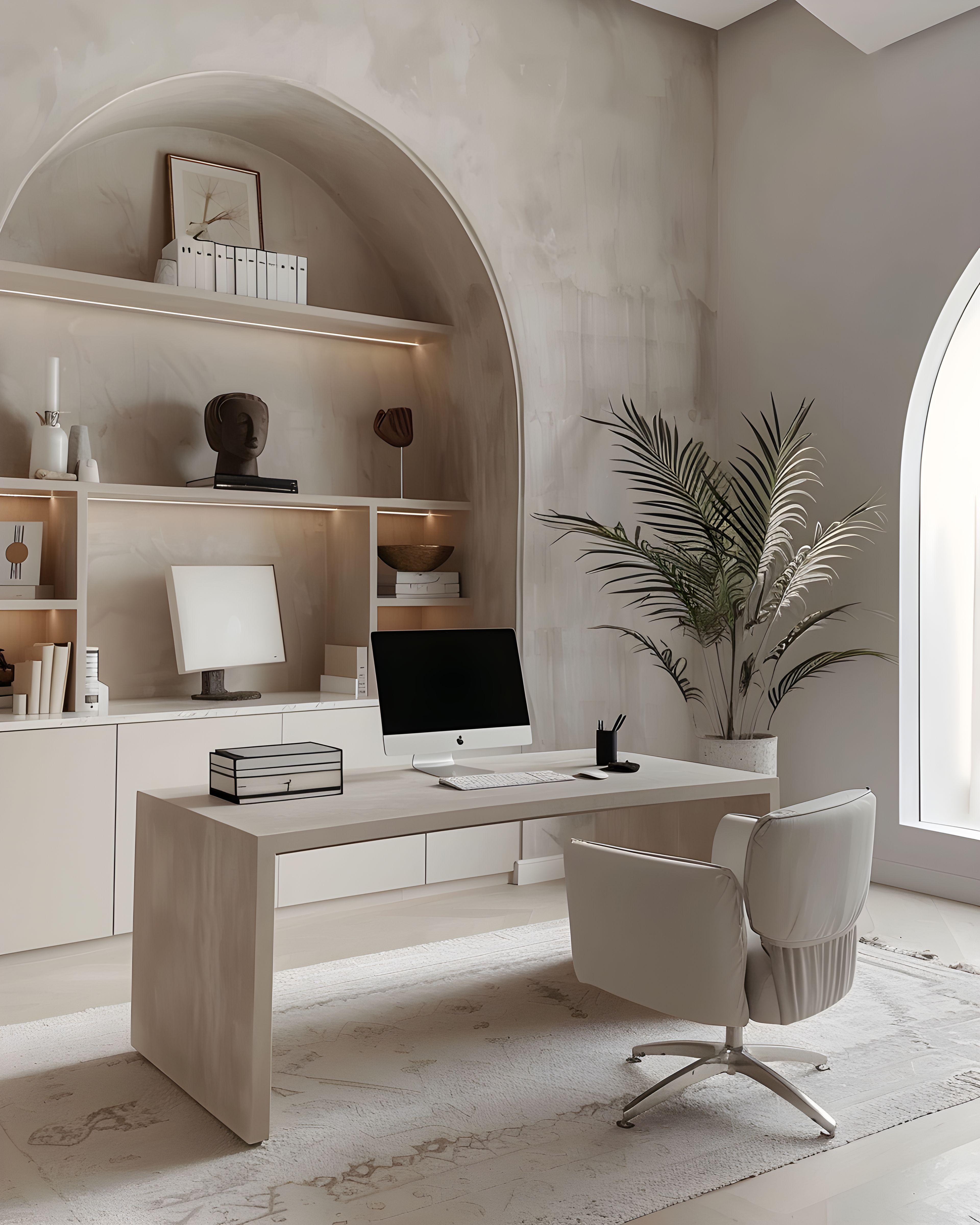
Whitespace is structure. It’s the gap between sections, the margin that gives your content room, the bit of space that stops a card from feeling rushed. For service-based businesses especially, that kind of calm makes you look like you know what you’re doing — you’re not trying to fill every corner because you don’t need to.
Good whitespace also helps your reader. When information is generously spaced, it’s easier to absorb, easier to remember, and easier to act on. A price list with plenty of room feels more trustworthy than one that crams every detail into every available centimetre. People pick up on that — if your stationery feels calm and clear, they assume you are too.
There’s a real confidence in leaving parts of a page empty. It says you’re comfortable with your message, that you don’t need to overstate or over-explain. For clients who are already overwhelmed by choices, that simplicity is a relief.

Keeping the same look from card to packaging
The trick with minimalist work is discipline: the same layout, the same accent details, the same approach to photography. When those things line up, you can add a thank you note or a flyer later and it still feels like the same studio — because the rules were simple from the start.
This is what separates minimalism from carelessness. A blank card with no thought behind it looks bare; a carefully designed card with proper spacing and a well-chosen typeface looks elegant. The difference is hard to describe, but you notice it straight away. Your repeat clients will come to expect that look, and new ones will pick up on it the moment they hold your card.
When you’re building your suite, start with the pieces you use most — typically a business card, a thank you note, and perhaps a simple insert. If these three share the same logic, every addition that follows will feel like a natural extension rather than a fresh start.
Order at a pace that suits your season
You might begin with cards and a single insert whilst you test a new offer. You might add menus or price lists when you go back to in-person events. Minimalism suits a gradual build better than most styles, as long as the look stays consistent.
There’s no prize for completing a full suite in a fortnight. In fact, the founders who take their time — adding a piece or two per season as real needs come up — tend to end up with collections that feel more thought-through than those assembled in one burst of enthusiasm. Each piece is a response to something you genuinely needed, not a guess about what you might.
Print-on-demand makes this gradual approach especially practical. You can order small quantities, adjust as you learn, and avoid having unused stock sitting in a drawer. Your stationery should grow at the same pace as your confidence and your client base — not faster.
Take your time
There’s no prize for finishing everything at once. A minimalist suite built slowly — piece by piece, season by season — often looks better than one designed in a rush. For related reading at a similar pace, calm stationery as a quiet ecosystem and thank-you cards and packaging inserts may help. Whenever you are ready to browse more broadly on the site, you can view the full collection here.
Browse the modern minimalist collection on Zazzle. Everything’s designed to sit together, so you can add to your suite over time as your business grows.
If you’d like to see the full range first, our main stationery collections hub has everything in one place.