Sage Green Studio Stationery for a Recognisable Brand
Soft sage paired with clean layouts — perfect for creatives who want colour without it being too much. Practical advice on keeping things consistent.

If you’ve been looking for a colour that feels like yours without taking over a room, sage green is often the answer. It sits between personality and restraint — visible enough to be recognisable, but never demanding.
A colour that works everywhere
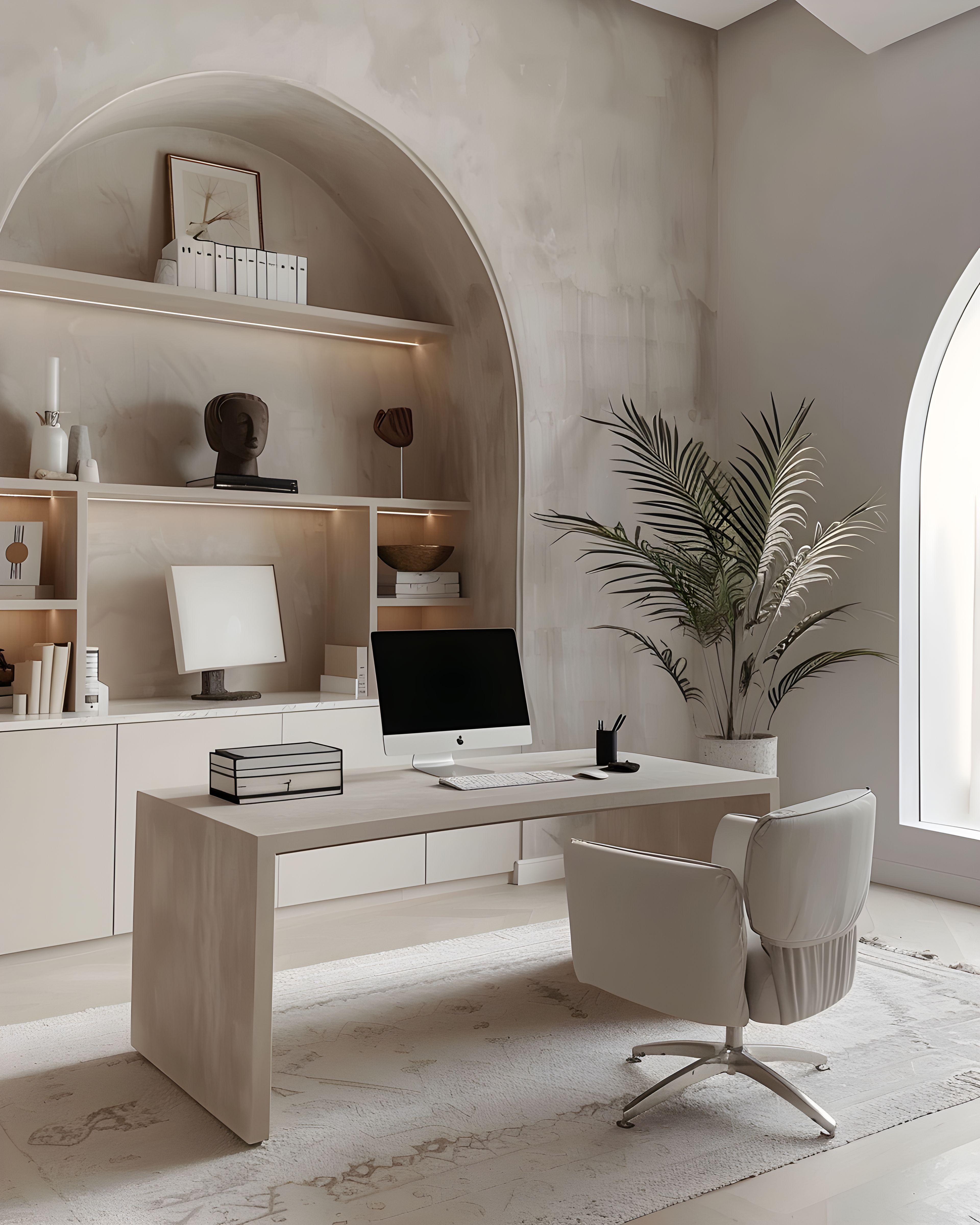
Sage occupies a rare space: clearly green, yet soft enough for any professional setting. It pairs beautifully with warm whites and soft greys, and it photographs well in natural British light — something worth remembering if you shoot flatlays or product images regularly.
What makes sage especially useful for small brands is its versatility. It works as a background or an accent, on a business card or a shipping label, in a serif setting or a sans-serif one. It’s warm without being sweet, and calm without being cold — which is harder to find in a green than you’d think. Unlike bolder colours that can feel a bit much, sage is the kind of thing that grows on people.
Keeping your colour palette simple
Decide early: one sage, one neutral, one deep accent (if any), and how much white you’ll allow. When those rules are clear but firm, you can design a card, a flyer, and packaging without reinventing yourself each time.
These constraints might feel limiting at first, but they’re actually freeing. With a defined palette, decisions get faster, proofs get simpler, and every new piece you produce feels like it belongs with everything else. Customers notice this — perhaps not consciously, but things just look right, and that matters.
If you work with a printer or a designer, sharing your palette rules at the start saves both time and revision rounds. A short document listing your sage, your neutral, and your white — with hex or Pantone references — can stop small inconsistencies from creeping in. It’s also worth thinking about how your palette looks on screen, since sage can shift slightly between monitors. Testing your chosen shade on your own website and social templates makes sure the printed and digital versions sit happily together.
Seasonal shifts without a rebrand
You can change up your photography, swap in a seasonal product shot, or add a limited-edition piece whilst the printed backbone stays sage-led. People notice consistency more than they notice novelty, and a brand that feels steady season after season tends to earn more trust than one that keeps changing its look.
This is one of sage’s real strengths: it doesn’t belong to any single season. It feels fresh in spring, grounded in autumn, and calm in winter. Where bolder colours can lock you into a particular moment, sage moves through the year without ever looking out of place. Try keeping a small library of seasonal photographs that work within your sage palette, refreshing the imagery on your website or social channels whilst your core stationery stays the same. That way things feel current without you having to redesign anything.

Making it work for you
Small studios often grow fastest when their print looks steady, not fussy. A sage-led palette gives you colour that’s recognisable without being rigid — and it only looks better as you add more pieces over time. For related reading at a similar pace, loyalty cards that still feel calm and brand consistency in print may help. Whenever you are ready to browse more broadly on the site, you can view the full collection here.
Browse the sage green studio collection on Zazzle. Everything’s designed to work together, so you can build your suite at your own pace as your business grows.
If you’d like to see the full range first, our main stationery collections hub has everything in one place.