Soft Neutral Stationery for a Warm, Professional Look
Warm undertones and clean typography for brands that want to look professional without going bold.
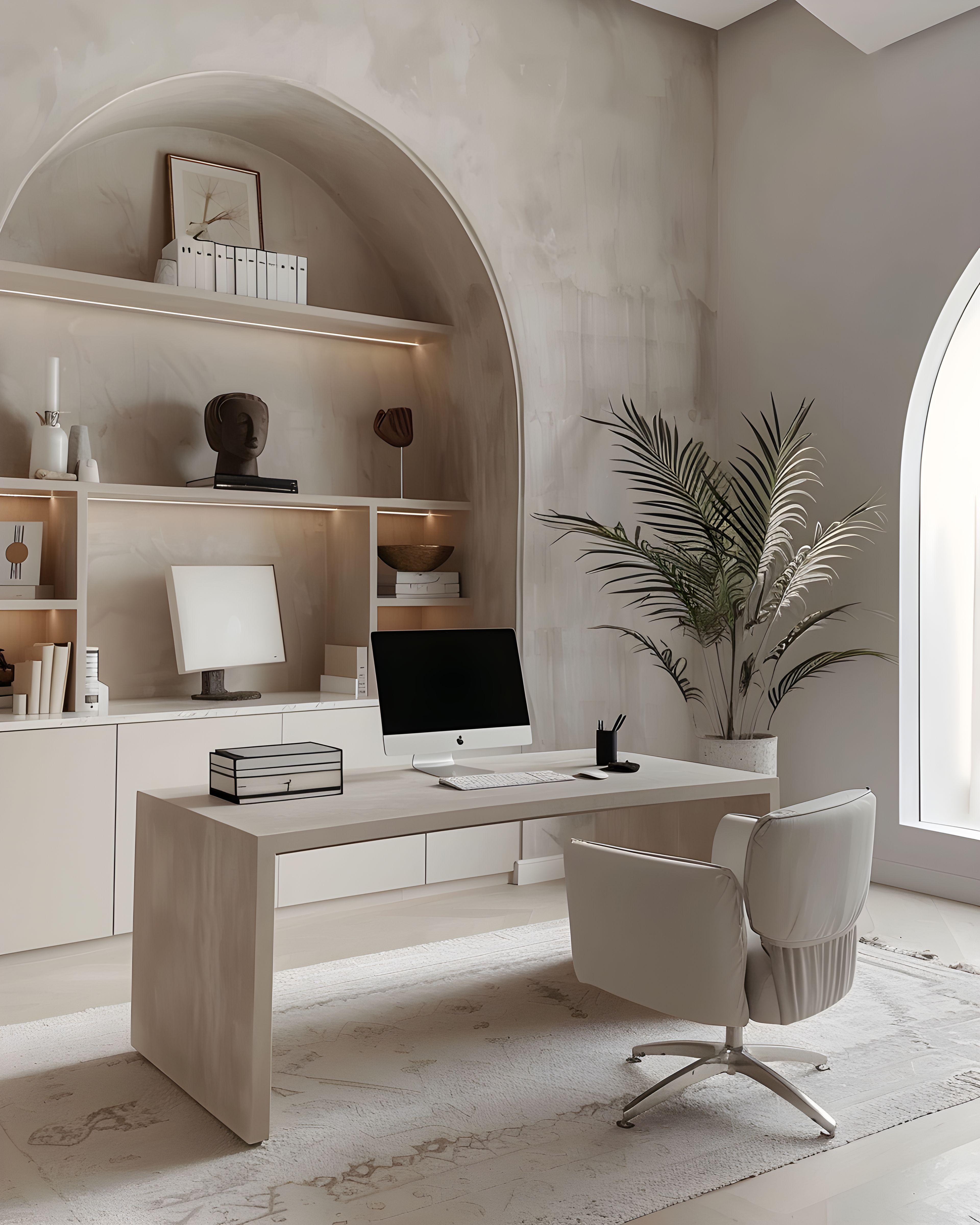
Warm, settled stationery suits brands that want to feel calm and grounded. It’s like walking into a room that’s been well put together — nothing demands attention, but everything feels right. For studios, makers, coaches, and small service businesses, that sense of being grounded can become something clients recognise and come back to.
Neutrals that feel welcoming, not chilly
The best soft neutrals carry a hint of warmth — cream, oat, pale stone — so your brand feels approachable as well as refined. It’s a particularly good fit for studios, makers, and coaches whose work is personal and human.
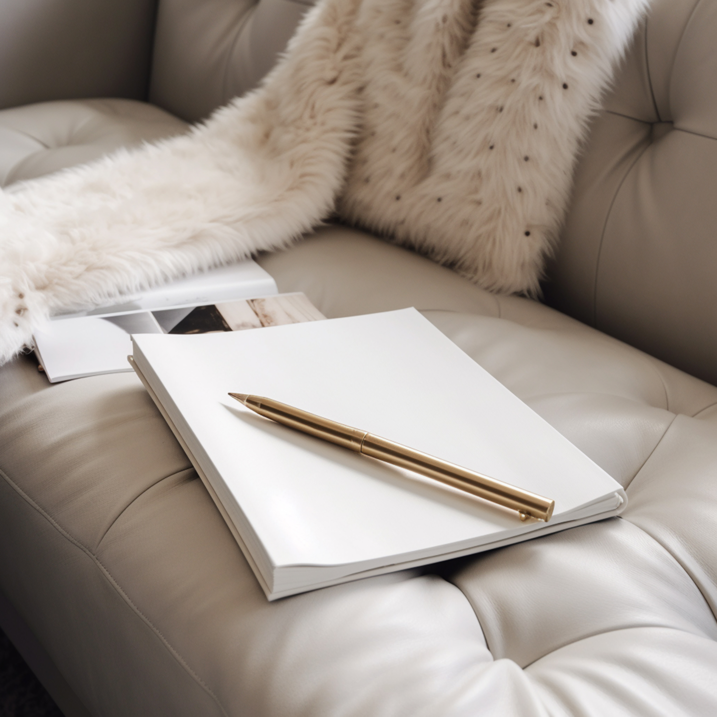
Warm neutrals work because they feel lived-in rather than clinical. A cool grey can read as sleek on screen but feel distant in print, whereas a creamy off-white or a soft sand tone invites the eye to stay. When choosing your palette, lean towards undertones that echo natural materials — linen, clay, unbleached paper — and your stationery will feel grounded without any effort.
This warmth also translates well across different printing methods and paper stocks. Unlike vivid colours, which can shift noticeably from one printer to another, warm neutrals tend to stay true. That’s a real advantage when you’re ordering from a print-on-demand service or reordering months later and hoping things match.
Making your print match your website
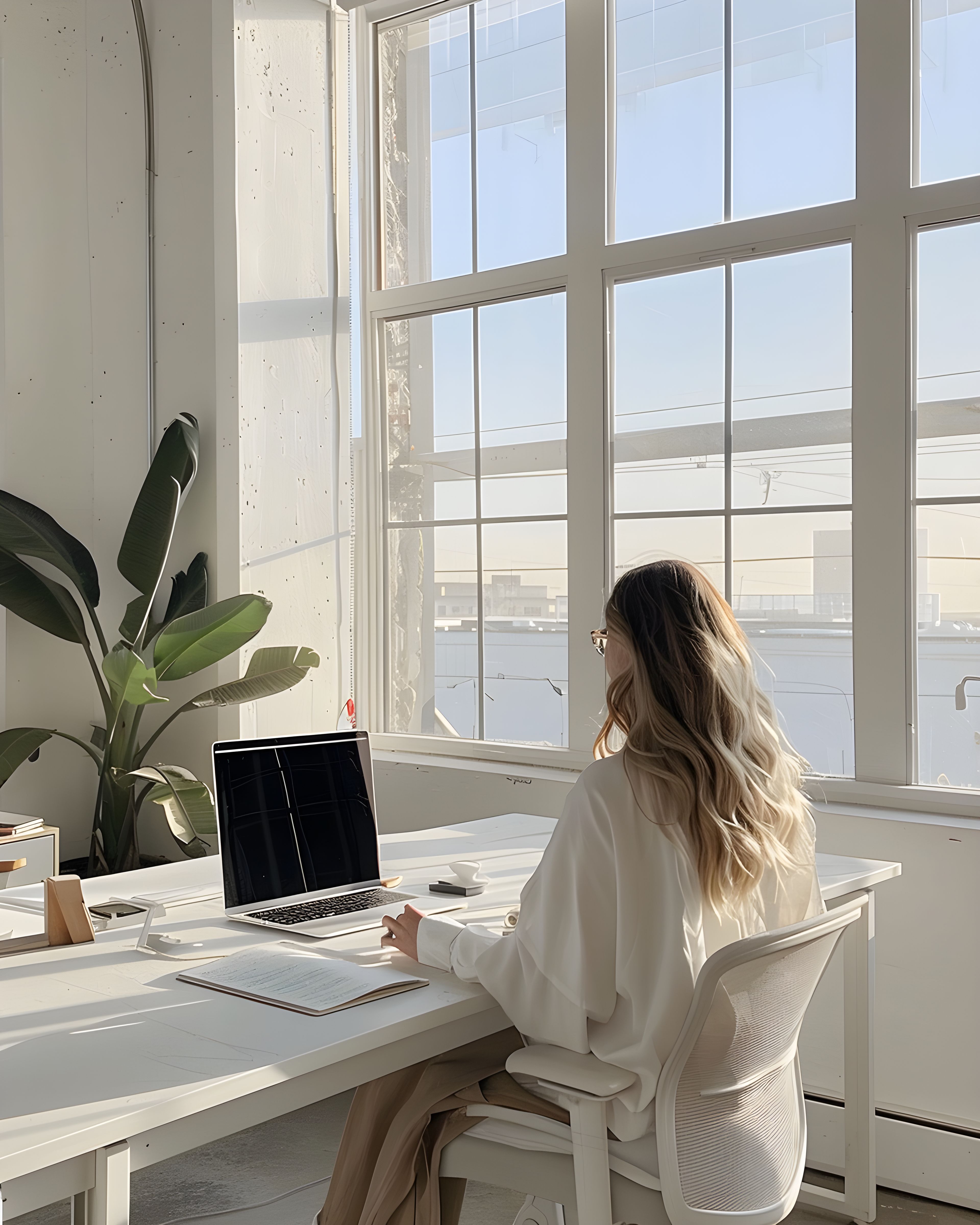
Your website probably already has this palette going. Printed pieces should carry on from that: similar contrast levels, similar spacing, similar finishes where you can manage it. Keeping things consistent isn’t about matching hex codes perfectly — it’s more about the overall feel.
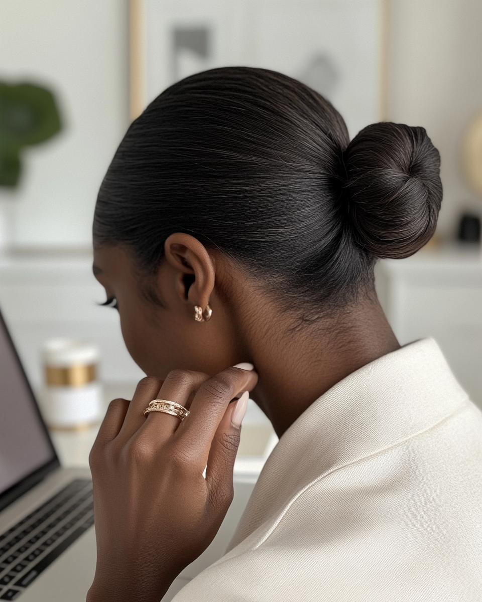
When a client moves from your Instagram feed to your website to a physical card in her hand, the transition should feel seamless. She might not consciously notice that the spacing on your business card matches your homepage, but she’ll feel it. That kind of consistency is what makes a brand feel trustworthy — it shows someone’s paid attention.
Printed stationery also offers something digital can’t: texture. The weight of a card, the softness of an uncoated finish, the warmth of a cream stock — how it feels in your hand adds something that a screen just can’t. It makes the whole thing feel more real.
Small touches people keep
Business cards, appointment reminders, and little thank you notes are often photographed, pinned, or left on a desk far longer than we’d expect. Choosing a line you can live with for several seasons saves you from restless rebranding.
A well-designed neutral piece has a particular kind of staying power. It doesn’t date the way a trend-driven design might, and it doesn’t clash with new products or services you bring in later. It just sits alongside whatever comes next, looking as settled as the day it was printed.
This longevity is worth thinking about when you choose your stationery. A design you love now but might tire of in six months costs more in the long run — not just in money, but in the energy of deciding, reordering, and explaining a new look to clients who’d only just got used to the last one.

A palette that grows with your business
Soft neutrals are naturally flexible. As your business expands — new services, new products, perhaps a new studio — your stationery can expand with it. A thank you note here, a packaging insert there, each new piece fitting naturally into the palette you’ve already set up.
That flexibility is one of the real strengths of a neutral system. It doesn’t box you in. It gives you a foundation that’s broad enough to handle change, yet distinctive enough to feel unmistakably yours. For related reading at a similar pace, a branding checklist before you order and bridging print and digital touchpoints may help. For a gentle sweep of styles and groupings in one place, the collections hub is there when you want it.
See what’s available
Soft neutrals tend to look more expensive with time, not less. You can browse the soft neutral collection on Zazzle to see the full range — everything’s designed to work together, so there’s no pressure to order it all at once.
If you’d like a wider view first, our main stationery collections hub lists everything in one place.