Typography-Led Stationery for Clean, Readable Design
Clean type, good spacing, and layouts where your words do the work. For coaches, writers, and experts who keep things simple.

Some businesses sell a feeling, but yours sells clarity. If you’re a writer, a coach, a therapist, or a consultant, people come to you because you know how to say things well — and your stationery should reflect that. Typography-led design isn’t about stripping everything back for the sake of it. It’s about giving your words enough room to do what they do best.
Making things easy to read
Good hierarchy tells people where to look first, second, and third. On a flyer or a welcome sheet, that order takes the pressure off — especially for new clients who are already making a dozen decisions. When headings are clear, body text is easy to follow, and calls to action sit where the eye naturally goes, readers feel guided rather than overwhelmed.
Think of it this way: you’re not asking someone to figure out your layout — you’re walking them through it. A well-structured page makes people feel looked after, even if they can’t quite say why. For service providers especially, that sort of thing says a lot about how you treat people once they’re through the door.

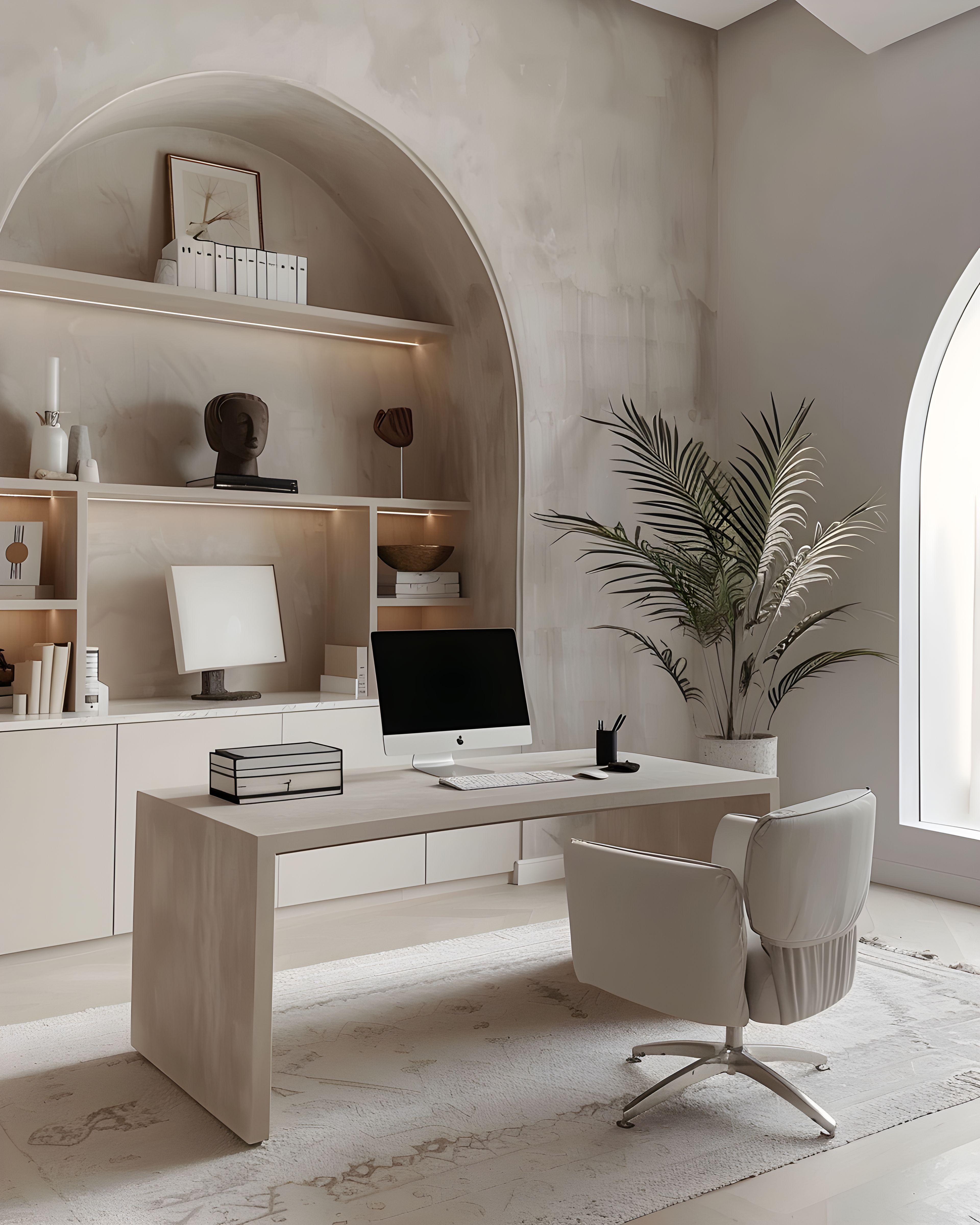
When less design does more
Typography-led work still needs restraint: one good typeface pairing, consistent spacing, and enough room around paragraphs so things don’t feel crowded. The goal is something that’s easy to read and feels calm — not a layout competition.
That means resisting the temptation to decorate. A single weight change or a well-placed line can do plenty on its own, without any fuss. When the design stays in the background, the words come through more clearly.
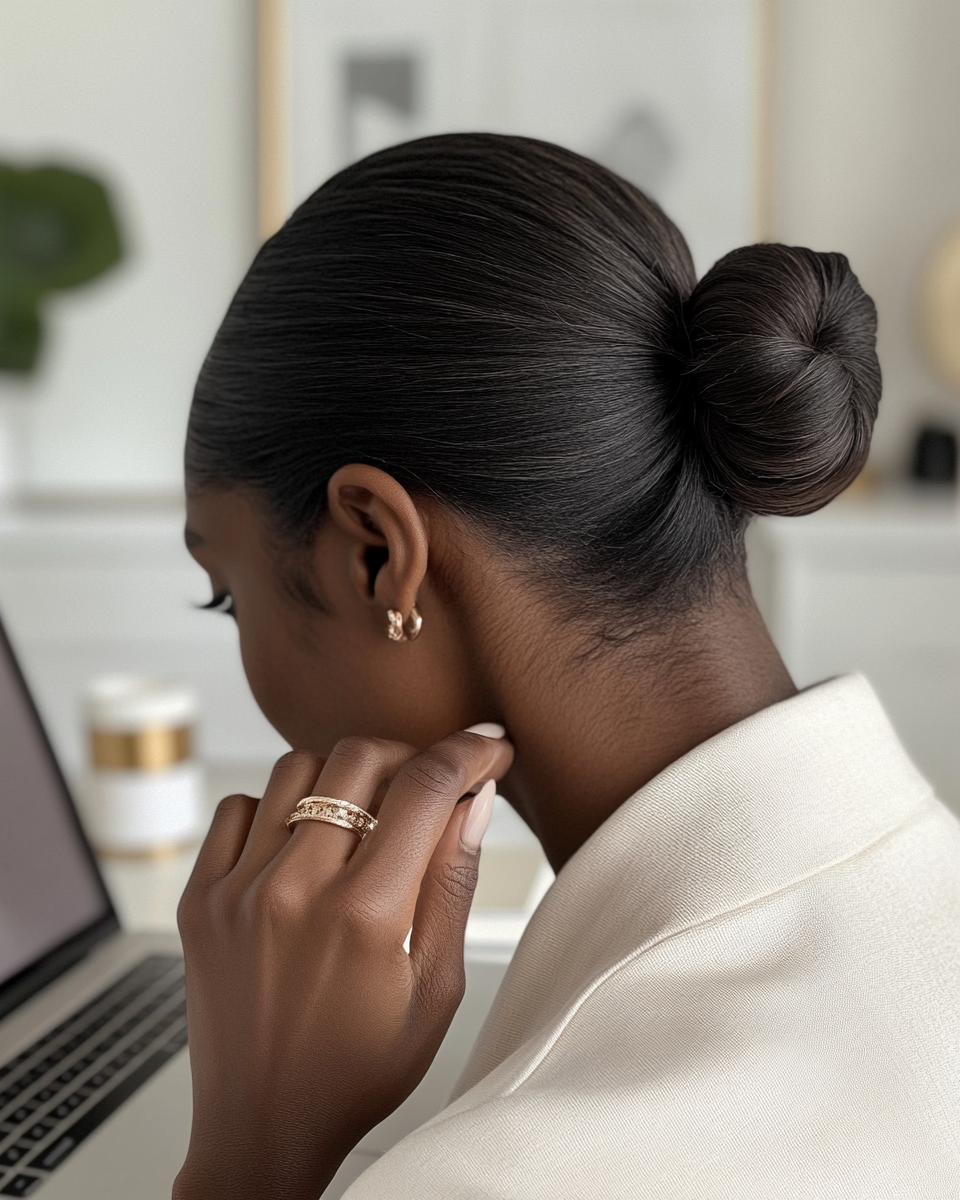
It also means paying attention to the small things that people notice without really thinking about it — the spacing between letters, how a paragraph flows, the way a quote sits on the page. These details are what make printed material feel professional rather than thrown together. They’re the difference between something a client keeps on their desk and something they set aside.
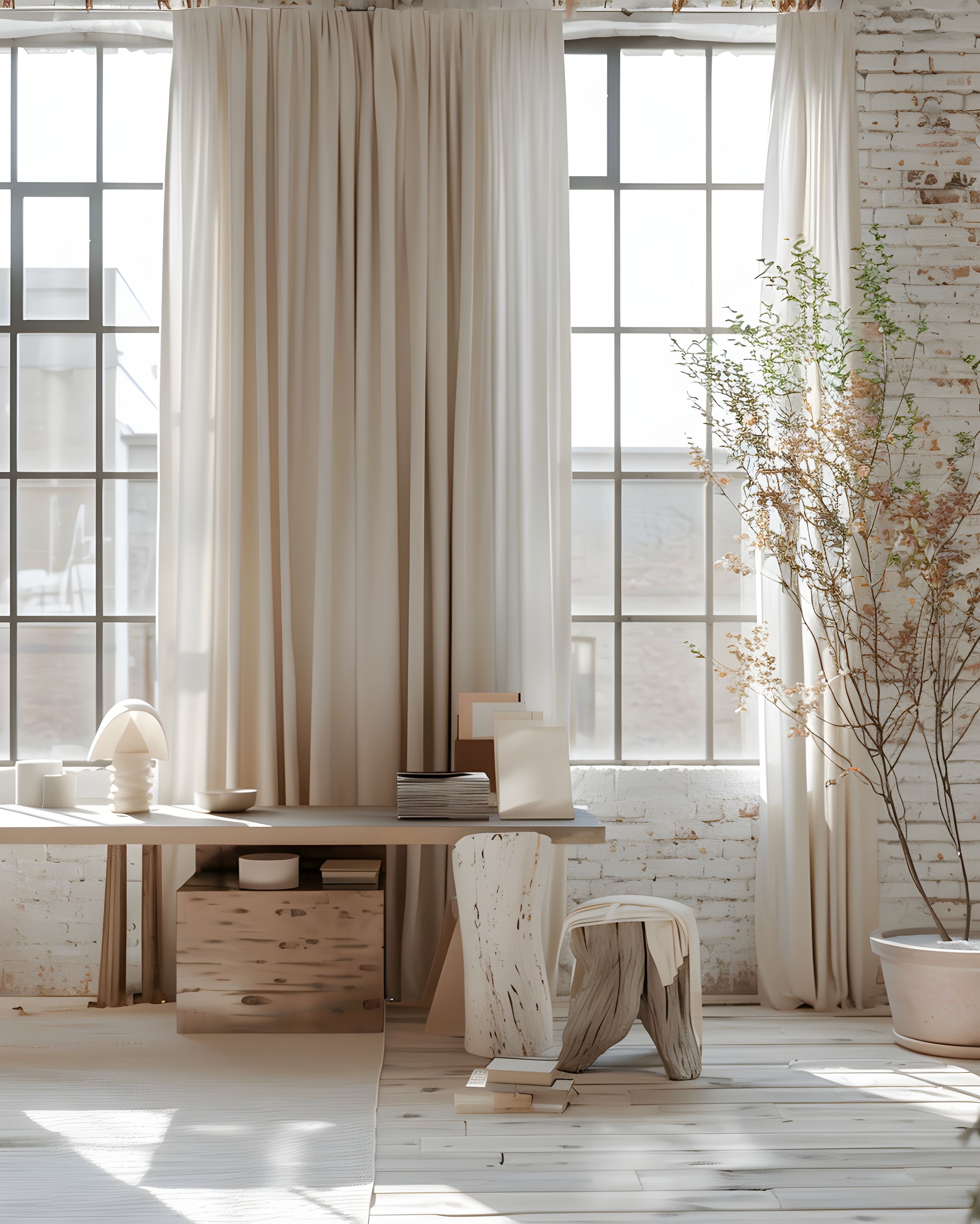
Print and PDF companions
Many typographic brands live half-online. If your printed proposals or welcome packs match the same type styles and spacing as your PDFs and email templates, clients get one steady, recognisable voice across everything you send.
This consistency matters more than most founders realise. A client who receives a nicely set welcome guide, then opens a matching invoice a week later, starts to trust the details of your business without even thinking about it. When everything looks like it belongs together, people assume you run a tight ship — and that sort of impression sticks.
When you’re planning your suite, think about which documents your clients see most often, and start there. A proposal template, a thank you card, and a simple set of digital headers can cover a surprising amount of ground when the typographic rules are shared between them. You don’t need everything at once; you just need the pieces you do have to look like they belong together.
Where to start
Good typography isn’t loud typography — it’s the kind of design that won’t look dated in a year, because it was never chasing a trend in the first place. If your words matter to your business, your stationery should do them justice. For related reading at a similar pace, packaging inserts in practice and client welcome cards may help. If you would like to see curated sets in one place on the site, you can explore matching designs here.
Browse the typography-led collection on Zazzle. Everything’s designed to work together, so you can add pieces over time as your business grows and your needs become clearer.
If you’d like to see the full range first, our main stationery collections hub has everything in one place.